


Mustafa Suleiman
-
المساهمات
20361 -
تاريخ الانضمام
-
تاريخ آخر زيارة
-
عدد الأيام التي تصدر بها
495
نوع المحتوى
ريادة الأعمال
البرمجة
التصميم
DevOps
التسويق والمبيعات
العمل الحر
البرامج والتطبيقات
آخر التحديثات
قصص نجاح
أسئلة وأجوبة
كتب
دورات
كل منشورات العضو Mustafa Suleiman
-
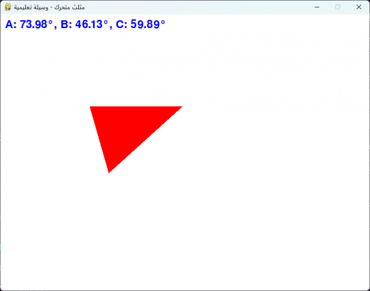
يظهر خطأ pygame.error: font not initialized عند تشغيل الكود بسبب السطر: font = pygame.font.Font(None, 36) والمشكلة أنّ الخط لم تهيئته بشكل صحيح، حيث يجب استدعاء الدالة pygame.init() في بداية البرنامج، مباشرة بعد استيراد مكتبة pygame، وستقوم تلقائيًا بتهيئة جميع وحدات pygame التي تم استيرادها. وسيظهر التالي، مثلث متحرك من اليسار إلى اليمين بشكل مستمر:
- 4 اجابة
-
- 1
-

-
 جيد جدًا، الأمر سيتحسن مع الوقت، حاول فقط التعمق قليلاً من خلال قراءة التالي:
 -
شعورك غير مطابق لما قمت به، طالما تستطيع تطوير موقع ويب بالكامل حتى لو بتصميم بسيط، فأنت على الطريق الصحيح، أي توظيف ما تعلمته والربط بين المفاهيم، وذلك يتأتى بتنفيذ تمارين عبارة عن نماذج أي أجزاء من الموقع بشكل متدرج ثم تنفيذ مشاريع ويب كاملة وهو ما قمت به. هل تستطيع تحويل أيًا من تصاميم الصفحات التالية إلى كود؟ https://www.frontendmentor.io/challenges?difficulty=1 لو تستطيع فلا داعي للقلق.
-
انتقل حاليًا إلى دورة جافاسكريبت ودراسة أساسيات جافاسكريبت بها، حيث يوجد تفصيل أكثر مقارنًة بدورة تطوير واجهات المستخدم والتي تُركز أكثر على تطوير الواجهة وليس اللغة. ثم أكمل دورة تطوير واجهات المستخدم إلى نهايتها، وبعد ذلك انتقل إلى دورة جافاسكريبت، وادرس المسارات التالية: أساسيات React.js تطبيق دردشة يشبه WhatsApp (تطبيق الويب فقط أي الواجهة الأمامية client من خلال react) أساسيات TypeScript إنشاء تطبيق أسئلة وأجوبة باستخدام Next.js تطبيق تعلم اللغات باستخدام Next.js وتقنيات الذكاء الاصطناعي تطبيقات الويب التقدمية PWA
- 6 اجابة
-
- 1
-

-
المشكلة تم حلها، تابع خطوات التثبيت
-
الكود غير صحيح، يوجد تطابق لعدد العناصر، فالدالة plt.scatter تتوقع أن يكون لكل نقطة أي لكل زوج من x و y لون مقابل لها. ما لديك هو 15 نقطة لأن طول القائمة x والقائمة y هو 15، ولكن قمت بتمرير 13 قيمة لون فقط في القائمة colors، لذا يجب إضافة قيمتين إلى قائمة colors لتصبح بطول 15. import matplotlib.pyplot as plt x = [2,2,8,1,15,8,12,9,7,3,11,4,7,14,12] y = [100,105,84,105,90,99,90,95,94,100,79,112,91,80,85] colors = [0, 10, 20, 30, 40, 45, 50, 55, 60, 70, 80, 90, 100, 110, 120] plt.scatter(x, y, c=colors, cmap='Purples') plt.colorbar() plt.show()
- 2 اجابة
-
- 1
-
-
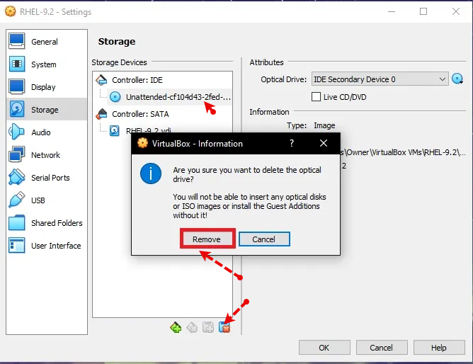
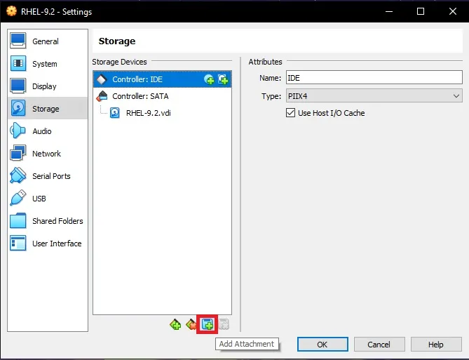
أغلق النظام، ثم اضغط على settings بعد ذلك اختر تبويب storage ثم أسفل Controller: IDE قم بإختيار القرص الموجود ثم اضغط على زر Remove بالأسفل واختر remove: ثم اضغط على زر الإضافة واختر optical drive: ثم اختر ملف الـ ISO الخاص بالنظام، ثم اضغط على OK للحفظ، وقم بالتجربة.
- 3 اجابة
-
- 1
-
-
عند تنفيذ أمر معين مثل npm install وخلافه، يتم البحث عن مسار مخصص لذلك في متغيرات البيئة في النظام، من أجل تشغيل npm أي ملف البرنامج الخاص بها، وأثناء التثبيت لأغلب البرامج يتم إضافة متغيرات بيئة بشكل تلقائي دونّ تدخل منك، في بعض الأحيان تحتاج إلى ذلك فقط. أي النظام يبحث مباشرًة في متغيرات البيئة عن مسار ملف npm.exe ليتمكن من تنفيذ أمر npm، وبالطبع لا يتم إضافة مسار الملف بشكل منفرد، بل المجلد الذي يحتويه، وفي أغلب البرامج هو باسم bin وستجد تفصيل هنا لطريقة الإضافة:
- 3 اجابة
-
- 1
-
-
اسم المتغير ثابت بينما المؤشر متغير وديناميكي، بمعنى هو مجرد label يضعه المترجم على مكان محدد في الذاكرة، والربط بين الاسم والمكان يتم في وقت الترجمة، وليس بإمكانك تغيير المكان الذي يشير إليه الاسم x، فسيظل يشير دائمًا إلى نفس العنوان في الذاكرة طوال فترة حياته. بينما المؤشر هو متغير بحد ذاته، وظيفته هي تخزين عنوان ذاكرة لمتغير آخر، وبما أنّ المؤشر متغير، فباستطاعتك تغيير القيمة التي يحملها أي العنوان الذي يشير إليه في أي وقت أثناء تشغيل البرنامج. للتوضيح، المؤشر مثل ورقة ملاحظات في يدك، تستطيع أن تكتب عليها شارع القاهرة، منزل رقم 10، ثم تمسحها وتكتب عنواناً آخر، مثل شارع النهضة، منزل رقم 55، فالورقة نفسها وهي المؤشر لم تتغير، لكن العنوان الذي تشير إليه تغير. بالتالي الفائدة تظهر مثلاً عند الحاجة إلى مساحة في الذاكرة أثناء تشغيل البرنامج ولا تعرف حجمها مسبقاً، فتستخدم دوال مثل malloc في C أو new في C++، وستحجز لك مكاناً في الذاكرة وتوفر عنوان بدايته، والطريقة الوحيدة للوصول إليه هي عن طريق مؤشر يخزن العنوان، ولا تستطيع تعيين اسم ثابت لأن المترجم لم يكن يعرف بوجوده أصلاً. المؤشر بالفعل يخزن عنوان أول بايت فقط من المتغير، الفكرة في نوع المؤشر، أي عند تعريفه تحدد نوع البيانات التي سيشير إليها: int* p_int; بالتالي المترجم يعلم حجم البيانات، حيث تلك العملية تسمى Dereferencing، بمعنى يعلم أن p_int هو مؤشر من نوع int، وبناءًا على ذلك، يذهب إلى العنوان المخزن في p_int ويقرأ 4 بايتات تالية أو حسب حجم الـ int في نظامك، ولو كان *p_double، لقرأ 8 بايتات. أيضًا حسابات المؤشرات، فبزيادة المؤشر p_int++ أو p_int + 1، فالمترجم لا يضيف 1 إلى العنوان بل يضيف حجم النوع الذي يشير إليه، حيث p_int + 1 سينتقل إلى العنوان التالي بمقدار sizeof(int) أي 4 بايتات. وp_double + 1 سينتقل إلى العنوان التالي بمقدار sizeof(double) أي 8 بايتات. في مكتبة CS50 وكذلك في لغة C، النوع string ليس كائن معقد مثل std::string في لغة C++، بل مجرد اسم بديل typedef لنوع char* typedef char* string; إذن، بكتابة التالي: string s = "HI!"; فالنص HI! والذي هو في الحقيقة {'H', 'I', '!', '\0'} يتم تخزينه في مكان ما في الذاكرة في قسم للقراءة فقط، والمتغير s يتم إنشاؤه بما أن string هو char*، فالمتغير s هو مؤشر. وقيمة المؤشر s تصبح هي عنوان أول حرف في النص، أي عنوان الحرف H، لذا عندما تسأل عن sizeof(s)، أنت لا تسأل عن حجم النص HI! بل تسأل عن حجم متغير المؤشر s نفسه. ويظهر 8 لأنك على الأغلب تستخدم نظام تشغيل بمعمارية 64-bit، والتي بها أي عنوان ذاكرة وبالتالي أي مؤشر يحتاج إلى 64 بت لتخزينه. 64 bits / 8 bits per byte = 8 bytes. بالنسبة لـ 32 فالرقم غريب لحجم مؤشر، لأنّ أنظمة 32-bit حجم المؤشر بها 4 بايت أي 32 بت، عامًة لا تستخدم sizeof واعتمد على دالة strlen() من مكتبة <string.h>: #include <stdio.h> #include <string.h> #include <cs50.h> int main(void) { string s = "HI!"; printf("Size of the pointer 's' itself: %lu\n", sizeof(s)); printf("Length of the string content: %lu\n", strlen(s)); }
-
دورة الذكاء الاصطناعي ليس لها علاقة بلغة PHP، ما تحتاجه هو التعمق في لغة بايثون، أتفهم سبب سؤالك، لكن سنستخدم مشاريع جاهزة أي متاجر إلكترونية جاهزة مطورة من خلال لغة PHP في المسار، فوظيفة تضمين النموذج في المتجر هي خاصة بمطور الواجهة الخلفية والذي سيقوم بتطوير الـ API، وليس أنت، لكن في الدورة تم شرح ذلك من أجل التعلم واكتساب تلك المهارة لو أردت، ولتوضيح كيف سيتم الاستفادة مما قمت به بشكل عملي. أي تعلم كيف يتم إنشاء API من خلال Flask أو Django ولكن تجاهل الجزء الخاص بـ PHP، ستجد الأكواد جاهزة.
-
هناك أمور أهم في البداية يجب التركيز عليها، فلا تشغل بالك بكتابة أفضل كود ممكن، بل اهتم بتنفيذ المطلوب أي جعل الكود يعمل بشكل سليم وفق المنطق الذي تريده، وذلك يتحقق من خلال العمل على تحسين مهارة التفكير المنطقي ومهارة التفكير برمجيًا، وكلاهما بحاجة إلى وقت وممارسة. بالطبع يجب هناك قواعد وأُسس لكتابة كود سليم وسهل القراءة والتعديل والتوسع، الفكرة أن ذلك غير مهم في البداية، ركز فقط على الأمور البسيطة مثل التسمية الواضحة وهو المبدأ رقم واحد الذي يجب أن تتبناه من اليوم الأول، ولن يكلفك وقت إضافي وسيحسن من جودة تفكيرك وكودك بشكل كبير. أيضًا لا تكرر نفسك وهو مبدأ DRY، أي عندما تتعلم الدوال، ابدأ فوراً في التفكير هل كررت ذلك الكود في أماكن متفرقة؟ إذن هل يمكنني وضعه في دالة؟ وإعادة استخدامها؟ ثم بعد تنفيذ مشروعين، تستطيع البدء في التركيز على باقي المفاهيم المتقدمة، وبعد تعلمها قم بتطبيقها علة تلك المشاريع من خلال عمل Refactor لكود المشروع، وستتعلم الكثير خلال ذلك، والأمر لن يكون سهل في البداية. وستجد تفصيل هنا بخصوص مفاهيم الكود النظيف:
- 3 اجابة
-
- 1
-
-
ستجد أسفل فيديو الدرس في نهاية الصفحة صندوق تعليقات كما هنا، أرجو طرح الأسئلة أسفل الدرس وليس هنا في قسم أسئلة البرمجة حيث نطرح الأسئلة العامة الغير متعلقة بمحتوى الدورة أو الدرس، وذلك لمساعدتك بشكل أفضل.
-
تفقد المسار الخاص بتطوير نماذج ذكاء اصطناعي لمتجر إلكتروني في الدورة وستفهم ما أقصد، حيث سنقوم بتلك العملية. وملف الـ readme ستجد تفصيل حوله هنا:
-
لا حاجة إذن إلى استخدام PHPMailer، فما تحتاجه هو الإعتماد على Telegram Bot API وإرسال محتوى الرسالة إلى البوت الخاص بك. أي إرسال الـ data الخاصة بالنموذج إلى الـ API التالي: $url = "https://api.telegram.org/bot{$botToken}/sendMessage"; بالطبع botToken هو متغير عليك إنشائه ووضع قيمة التوكن الخاصة بالبوت الذي قمت بإنشائه على تليجيرام، وستحتاج أيضًا إلى إرسال الـ chatId الخاص بالبوت مع البيانات في جسم الطلب body. وبالطبع عليك تهيئة نص الرسالة ومعالجته قبل إرساله إلى هاتفك، ومعالجة الأخطاء الواردة، كالتالي: <?php header('Content-Type: application/json'); define('BOT_TOKEN', 'هنا'); // ضع التوكن هنا define('CHAT_ID', 'هنا'); // ضع معرف الشات هنا if ($_SERVER['REQUEST_METHOD'] !== 'POST') { http_response_code(405); echo json_encode(['ok' => false, 'message' => 'يجب استخدام طريقة POST فقط']); exit; } $errors = []; $name = trim($_POST['name'] ?? ''); $email = trim($_POST['email'] ?? ''); $message = trim($_POST['message'] ?? ''); if (empty($name)) { $errors[] = 'حقل الاسم مطلوب.'; } if (empty($email)) { $errors[] = 'حقل البريد الإلكتروني مطلوب.'; } elseif (!filter_var($email, FILTER_VALIDATE_EMAIL)) { $errors[] = 'صيغة البريد الإلكتروني غير صحيحة.'; } if (empty($message)) { $errors[] = 'حقل الرسالة مطلوب.'; } if (!empty($errors)) { http_response_code(400); echo json_encode(['ok' => false, 'errors' => $errors]); exit; } $safe_name = htmlspecialchars($name, ENT_QUOTES, 'UTF-8'); $safe_email = htmlspecialchars($email, ENT_QUOTES, 'UTF-8'); $safe_message = htmlspecialchars($message, ENT_QUOTES, 'UTF-8'); $text = "<b>📩 رسالة جديدة من موقعك</b>\n\n"; $text .= "<b>👤 الاسم:</b> " . $safe_name . "\n"; $text .= "<b>📧 البريد:</b> " . $safe_email . "\n"; $text .= "<b>💬 الرسالة:</b>\n" . $safe_message; $url = "https://api.telegram.org/bot" . BOT_TOKEN . "/sendMessage"; $data = [ 'chat_id' => CHAT_ID, 'text' => $text, 'parse_mode' => 'HTML' ]; $ch = curl_init(); curl_setopt($ch, CURLOPT_URL, $url); curl_setopt($ch, CURLOPT_POST, true); curl_setopt($ch, CURLOPT_POSTFIELDS, http_build_query($data)); curl_setopt($ch, CURLOPT_RETURNTRANSFER, true); curl_setopt($ch, CURLOPT_TIMEOUT, 10); $response = curl_exec($ch); $http_code = curl_getinfo($ch, CURLINFO_HTTP_CODE); $curl_error = curl_error($ch); curl_close($ch); if ($curl_error) { http_response_code(500); echo json_encode(['ok' => false, 'message' => 'فشل الاتصال بـ cURL: ' . $curl_error]); } elseif ($http_code !== 200) { http_response_code(500); echo json_encode(['ok' => false, 'message' => 'واجهة التلغرام أرجعت خطأ.', 'response' => json_decode($response)]); } else { $telegramResponse = json_decode($response, true); if (isset($telegramResponse['ok']) && $telegramResponse['ok'] === true) { http_response_code(200); echo json_encode(['ok' => true, 'message' => 'تم إرسال الرسالة بنجاح!']); } else { http_response_code(500); echo json_encode(['ok' => false, 'message' => 'فشل إرسال الرسالة حسب رد التلغرام.', 'response' => $telegramResponse]); } } ?>
- 2 اجابة
-
- 2
-
-
-
لا مشكلة في ذلك، طالما المجلد تم تقسيمه بشكل مُنظم يوضح كل مسار والتطبيقات الخاصة به، فتستطيعي رفع المجلد بالكامل على مستودع واحد. لذا التسمية الخاصة بالمجلدات هامة جدًا، فالتسميات العشوائية ستؤدي إلى صعوبة مراجعة التطبيقات العملية، والأسهل تسمية كل مجلد باسم الدرس الخاص به كما في الدورة. وبالنسبة لـ GitHub فلا تنتظري لحين الإنتهاء من الدورة بالكامل واستخدامه، الأفضل دفع ما قمتي بإنهائه إلى المستودع أولاً بأول، وذلك من خلال أوامر بسيطة، ستجدي توضيح لها هنا: ولاحظي أنّ أمر git init يتم تنفيذه مرة واحدة فقط لإنشاء مستودع مجلي في مسار المجلد الرئيسي AI
-
أبسط وأسهل ليس بشكل مُطلق، بل بناءًا على نوع المشروع، دائمًا في البرمجة لا تشغل بالك بالتقنية بل المشكلة التي بين يديك، وعلى أساسها تختار التقنية الأنسب لها، والأنسب هنا يتوقف على أمور كثيرة. لكن للتبسيط، إطار Django يوفر لك كل تحتاجه لبناء تطبيق ويب كبير ومتكامل، بما في ذلك لوحة تحكم للمدير جاهزة لإدارة محتوى موقعك، نظام للتعامل مع قواعد البيانات ORM قوي ومدمج، نظام للمستخدمين والصلاحيات لتسجيل الدخول والخروج وإدارة المستخدمين، نظام حماية مدمج ضد الهجمات الشائعة، وهيكلية واضحة حيث يفرض عليك طريقة معينة لتنظيم ملفاتك، وذلك يسهل العمل عليك وعلى الآخرين أيضًا في الفرق الكبيرة. بالتالي الميزة هنا هي سرعة هائلة في تطوير المشاريع الكبيرة والتقليدية كمتجر، مدونة أو نظام إدارة محتوى، فكل شيء جاهز، فقط عليك استخدامه، وأنت مجبر على استخدام طريقة دجانجو في العمل، أيضًا، هو أثقل حجمًا، فبدء مشروع بسيط من خلاله يتطلب إنشاء عدة ملفات ومجلدات. بالتالي ذلك التعقيد يتطلب مشروع متوسط إلى كبير مثل المشاريع السابق ذكرها، والتي بها يوجد نماذج بيانات معقدة وعلاقات بين الجداول. وبخصوص Flask، فكلمة أبسط تقصد بها كود قليل، ملفات قليلة، مفاهيم أقل، وذلك صحيح لكن أبسط يصبح أصعب عند الحاجة إلى حلول لم تأتِ مع Flask بشكل مدمج مثل صلاحيات المستخدمين، لوحة تحكم إدارية، نماذج ORM قوية، صلاحيات دقيقة، وخلافه. لذلك ننظر إلى المشكلة، لا إلى أي إطار أخف، وهو أنسب بالنسبة للمشاريع الصغيرة والتي بها يكون عدد endpoints أقل من 10، أو برنامج webhook أو روبوت بسيط يستمع لإشعارات، أو سكربت يُطلق مرة في اليوم لتنفيذ job بسيط. وكذلك هو الأنسب لتعلم أساسيات تطوير الويب من خلال بايثون، حيث ستتفهم كيف يُبنى الـ routing، والـ middleware، وكيف تختار قاعدة البيانات بنفسك.
-
إجراء توثيق الهوية إجراء قانوني وروتيني يُفرض الالتزام بتطبيقه في مواقع حسوب، تستطيع البحث عن نظام Know your customer المطلوب تنفيذه من قبل الشركات. وذلك لتأمين الخدمات المالية ومنع عمليات الاحتيال، مساعدة المستخدم على استعادة حسابه في حال فقدانه أو تعرّضه للسرقة، وضمان عدم استفادة أي شخص آخر من الحساب، منع استنساخ الحسابات وتكرارها ما يساعد على منع انتحال الشخصية، ضمان امتثال المستخدمين لشروط استخدام الموقع، والتأكد أن عمر المستخدم 18 سنة فما فوق بحيث يكون قادراً على تقديم الخدمات بجودة عالية والالتزام بالشروط في حال العمل على منصات العمل الحر الخاصة بحسوب مثل مستقل وخمسات، وكذلك إلتزام الأكاديمية نحوه بالشروط المذكورة في وصف الدورات. ولا يتم مشاركة البيانات الشخصية للمستخدمين مع أي طرف ثالث ونحرص على تخزينها مشفرة بأمان.
-
الأمر غير قانوني، فالتطبيق نفسه لا مشكلة في تطويره، ستحتاج أولاً إلى تعلم برمجة تطبيقات الهاتف، وأسهل تقنية حاليًا هي flutter، وستجد مصادر لتعلمها على اليوتيوب، بعد ذلك ستحتاج إلى تعلم الواجهة الخلفية لتتمكن من إدارة الخادم (السيرفر) للتطبيق، والذي سيتم عليه تخزين البيانات وأيضًا إدارة قاعدة البيانات. وبخصوص المحتوى، فتلك التطبيقات لا تملك حقوق بث حلقات الأنمي، بل تقوم بسحب الحلقات المترجمة من مواقع أخرى غير شرعية أي مواقع القرصنة، وتقديم تلك الحلقات المسروقة للمستخدمين في تطبيق سهل الاستخدام. ولتقوم أنت بذلك بشكل شرعي ستقوم بعرض معلومات فقط عن المسلسلات والحلقات ثم توجيه المستخدمين للمشاهدة على مواقع أجنبية مشهورة تمتلك حقوق بث ذلك المحتوى. وللحصول على معلومات استخدام الـ API's التالية: https://www.jsonapi.co/public-api/category/Anime
-
ستحتاجين إلى مجموعة من المؤشرات لتحصلي على الصورة كاملة، والجهاز بالفعل يوفر متوسط الإضاءة، وذلك يسهل المقارنة إلى حد كبير، وأبسط طريقة هي كالتالي، أولاً قبل أي عملية حسابية، يجب التأكد من أن قيم المحاكاة والقيم المقاسة تمثل نفس الظروف تمامًا وفقًا لما يلي: نفس اليوم ونفس الساعة بالضبط. يجب أن يتم حساب متوسط الإضاءة في برنامج المحاكاة على نفس مساحة العمل التي تم القياس فيها، وتأكدي من أن ارتفاع شبكة النقاط في المحاكاة وموقعها يطابقان مكان وضع جهاز القياس. يجب أن يكون نموذج السماء المستخدم في المحاكاة، مثلاً CIE Clear Sky أو CIE Overcast Sky، مطابق لحالة السماء الفعلية وقت القياس، فذلك من أهم عوامل الخطأ. والمؤشر الأول، هو حساب الخطأ النسبي المئوي Percent Error، وكقاعدة عامة في دراسات الإضاءة، خطأ أقل من 15-20% يمكن اعتباره جيد جدًا، وهو الأنسب لو لديكِ قراءة واحدة أو عدد قليل. Percent Error = |(Simulated Value - Measured Value) / Measured Value| * 100% ولو يتوفر قراءات متعددة على مدار اليوم، ارسمي مخطط التشتت فهو يعطي أقوى انطباع بصري عن دقة النموذج، واحسبي RMSE للحصول على حجم الخطأ الكلي، وMBE لتتعرفي على ما إذا كان هناك تحيز منهجي في المحاكاة. ولو وجدتي أن الخطأ كبير، قومي بمراجعة المدخلات الأكثر تأثيرًا في المحاكاة: نفاذية الزجاج للضوء المرئي Visible Light Transmittance - VLT. انعكاسية الأسطح الداخلية (الجدران، الأرضيات، الأسقف). دقة نموذج السماء المستخدم. أي استخدمي Percent Error كخطوة أولى، ولو الخطأ أقل من 15%، فذلك مؤشر جيد، ثم أضيفي 3–5 قياسات إضافية في مواقع استراتيجية (وسط الغرفة، قرب النافذة، أبعد نقطة عن الضوء) واحسبي RMSE لها، ولو اختلفت النتائج كثيرًا بين النقاط، استخرجي خريطة إضاءة من المحاكاة ومقارنتها بصور عالية الدقة.
-
عند التصغير لمقاس 462px تبدأ المشاكل في الظهور، حيث يظهر شريط تمرير بالأسفل بالتالي هناك مشكلة في التجاوبية، ستحتاج إلى حذف الـ padding الخاص بتنسيق كلاس contatiner في ملف index.css @media screen and (max-width: 462px) { .container { padding: 0; } } وعند التصغير أكثر لا يتجاوب الموقع بشكل سليم، والمشكلة في الجزء الخاص بالخدمات services حيث قمت بتحديد عرض وطول ثابت للعناصر داخل الـ grid بالتالي تصبح غير متجاوبة، يجب جعلها مرنة. في البداية إنشاء grid متجاوب كالتالي في src\Components\Services\services.css : .services .services-cards { display: grid; grid-template-columns: 1fr; grid-gap: 1rem; } @media (min-width: 300px) { .services .services-cards { grid-template-columns: repeat(auto-fill, minmax(250px, 1fr)); } } وحذف أي كود خاص بإنشاء الـ grid في باقي الملف. ثم حذف أي كود خاص بتعديل العرض width والطول للعناصر بداخل الـ grid. ونفس الحال في ملف gym.css لكن ستحتاج إلى استخدام flexbox فالتصميم هنا لا يناسبه الـ grid. الأسهل لك الإعتماد أكثر على الـ flexbox واستخدام grid عند الحاجة، وكذلك بالنسبة للصور يجب استخدام max-width: 100% لتصبح متجاوبة وليس تعيين قيمة ثابتة لها، بل القيمة الخاصة بالعرض تكون للعنصر الأب الذي يحتويها. نفس الحال بالنسبة للقسم للتالي: .features .content-features { max-width: 500px; } أرفقت لك المشروع بعد التعديل. alshahba-gym.zip
-
بالنسبة لمعرض الأعمال الأمر مختلف، ستقوم برفع ملف الـ Notebook بداخل مجلد منفصل، ثم رفع نفس الكود في ملف بايثون لكن بتقسيمه إلى ملفات قابلة لإعادة الاستخدام، وملف requirements.txt لتحميل المكتبات الخاصة بالمشروع، وملف README.md لشرح المشروع. بمعنى ضع كل الكود المنطقي والقابل لإعادة الاستخدام مثل تحميل البيانات، المعالجة المسبقة، تعريف النموذج، ودوال التدريب في ملفات بايثون داخل مجلد خاص باسم src. ثم استخدم الـ Notebook للشرح والعرض وقم باستيراد الدوال والفئات من ملفات .py واستخدمها. ml_project/ ├── notebooks/ │ └── analysis_and_visualization.ipynb │ ├── src/ │ ├── __init__.py │ ├── data_processing.py # دوال معالجة البيانات │ ├── model.py # تعريف بنية النموذج │ └── train.py # سكربت لتدريب النموذج │ │ ├── requirements.txt └── README.md
- 3 اجابة
-
- 1
-
-
ستجد أسفل فيديو الدرس في نهاية الصفحة صندوق تعليقات كما هنا، أرجو طرح الأسئلة أسفل الدرس وليس هنا في قسم أسئلة البرمجة حيث نطرح الأسئلة العامة الغير متعلقة بمحتوى الدورة أو الدرس، وذلك لمساعدتك بشكل أفضل.
-
ستجد أسفل فيديو الدرس في نهاية الصفحة صندوق تعليقات كما هنا، أرجو طرح الأسئلة أسفل الدرس وليس هنا في قسم أسئلة البرمجة حيث نطرح الأسئلة العامة الغير متعلقة بمحتوى الدورة أو الدرس، وذلك لمساعدتك بشكل أفضل.
- 1 جواب
-
- 1
-
-
لا يوجد مشكلة في الكود، بل في أداة إختبار التجاوب في المتصفح في جوجل كروم، في بعض الأحيان ستجد مساحة فارغة جهة اليمين أو اليسار، وستحتاج إلى تنسيق CSS معين لمنع ظهورها أثناء تطوير المشروع. الأسهل هو استخدام إضافة لإختبار التجاوب ومن بين الإضافات الجيدة يوجد Pixefy - Responsive Design Checker
-
الأمر ليس بتلك السهولة لكن ممكن بالطبع، الفكرة أنّ التخزين السحابي متوفر من خلال منصات الشركات الكبيرة مثل Google أو Microsoft أو أمازون، بالتالي مستوى الحماية مرتفع للغاية هنا، بسبب وجود قسم كامل مختص بالحماية، فهناك شركات وأشخاص من جميع أنحاء العالم تعتمد على تلك المنصات في التخزين السحابي وخدمات أخرى. فمعظم الخدمات تستخدم تشفير AES-256 أثناء التخزين وTLS أثناء النقلK ,تُدار البيانات عبر لوحات تحكم مركزية تتطلب مصادقة متعددة العوامل وصلاحيات دقيقة. وشركات مثل AWS وGoogle تستخدم أنظمة كشف تسلل متقدمة IDS وIPS وتقوم بمراقبة سلوك المستخدم. أيضًأ تخضع المنصات السحابية الكبيرة لمعايير مثل ISO 27001، SOC 2، وGDPR، مما يزيد من صعوبة الثغرات. أغلب الإختراقات تتم من خلال المستخدم نفسه، بمعنى استخدام كلمات مرور ضعيفة أو تكرارها، الضغط على روابط تصيد phishing تسرق بيانات الدخول، أو عدم تفعيل المصادقة الثنائية 2FA. أو مشاركة ملفات علنية دون قصد، أو منح صلاحيات مفرطة لتطبيقات غير موثوقة. وللعلم اختراق مزود الخدمة نفسه نادر جدًا، لكن وارد فهناك حوادث مثل اختراق iCloud عام 2014 حيث تم الأمر عبر تصيد، وليس ثغرة تقنية.
