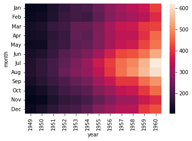
إياد أحمد نشر 23 ديسمبر 2021 أرسل تقرير نشر 23 ديسمبر 2021 لدي ال heatmap التالية: import seaborn as sns import matplotlib.pyplot as plt example = sns.load_dataset("flights") example = example.pivot("month", "year", "passengers") res = sns.heatmap(example) plt.show() والخرج: أريد الآن طريقة لإضافة إطار إلى ال Axes؟ 1 اقتباس
1 Ali Haidar Ahmad نشر 23 ديسمبر 2021 أرسل تقرير نشر 23 ديسمبر 2021 للقيام بالأمر يمكنك أن تستخدام كُلاً من الدالة axvline التي تقوم برسم خط عمودي والدالة axhline التي تقوم برسم خط أفقي.حيث نقوم برسم خطين أفقين وخطين عموديين وبالتالي نشكل إطار. سنرسم الخط الأفقي الأول عند النقطة y=0، والخط الأفقي الثاني عند y=عدد الصفوف في مجموعة البيانات الخاصة بك. سنرسم الخط العمودي عند x=0 و الثاني عند x=عدد الأعمدة في مجموعة البيانات. import seaborn as sns import matplotlib.pyplot as plt example = sns.load_dataset("flights") example = example.pivot("month", "year", "passengers") res = sns.heatmap(example) # الخطين الافقيين res.axhline(y = 0, color='c',linewidth = 10) res.axhline(y = example.shape[1], color = 'c', linewidth = 10) # العموديين res.axvline(x = 0, color = 'c', linewidth = 10) res.axvline(x = example.shape[0], color = 'c', linewidth = 10) plt.show() هنا أضفنا إطار لونه أزرق فاتح (سمائي). 1 اقتباس
1 Ahmed Sharshar نشر 26 ديسمبر 2021 أرسل تقرير نشر 26 ديسمبر 2021 بالاضافة للطريقة السابقة يمكنك استخدام ايضا الطريقة التالية: for _, spine in res.spines.items(): spine.set_visible(True) المثال التالي يوضح كيف نضيف اطاراً حول الأربع أركان: import seaborn as sns import numpy as np import pandas as pd import matplotlib.pyplot as plt data = np.array([[25.55535942, 1.99598017, 9.78107706], [ 4.95758736, 39.68268716, 16.78109873], [ 0.45401194, 0.10003128, 0.6921669 ]]) df = pd.DataFrame(data=data) fig = plt.figure(num=None, figsize=(10, 10), dpi=80, facecolor='w', edgecolor='k') cmap = sns.cubehelix_palette(light=1, as_cmap=True) res = sns.heatmap(df, annot=True, vmin=0.0, vmax=100.0, fmt='.2f', cmap=cmap, cbar_kws={"shrink": .82}) res.invert_yaxis() #اظهار الاطار for _, spine in res.spines.items(): spine.set_visible(True) plt.title('Seaborn heatmap - with frame') plt.savefig('seaborn_heatmap_with_frame_01.png') plt.show() ويظهر الاطار كالتالي: بالإضافة لهذا يمكننا وضع إطار حول كل خليه داخل الرسمة كذلك بنفس الطريقة كالتالي: import seaborn as sns import numpy as np import pandas as pd import matplotlib.pyplot as plt data = np.array([[25.55535942, 1.99598017, 9.78107706], [ 4.95758736, 39.68268716, 16.78109873], [ 0.45401194, 0.10003128, 0.6921669 ]]) df = pd.DataFrame(data=data) fig = plt.figure(num=None, figsize=(10, 10), dpi=80, facecolor='w', edgecolor='k') cmap = sns.cubehelix_palette(light=1, as_cmap=True) res = sns.heatmap(df, annot=True, vmin=0.0, vmax=100.0, fmt='.2f', cmap=cmap, cbar_kws={"shrink": .82}, linewidths=0.1, linecolor='gray') #اظهار الاطار res.invert_yaxis() plt.title('Seaborn heatmap - with frame') plt.savefig('seaborn_heatmap_with_frame_and_cell_border_01.png') plt.show() وتظهر كالتالي: لاحظ اننا يمكننا تغيير لون الإطار كذلك باستخدام الألوان المتاحة في المكتبة، وكذلك عرضة وحجمه. اقتباس


السؤال
إياد أحمد
لدي ال heatmap التالية:
والخرج:
![]()
أريد الآن طريقة لإضافة إطار إلى ال Axes؟
2 أجوبة على هذا السؤال
Recommended Posts
انضم إلى النقاش
يمكنك أن تنشر الآن وتسجل لاحقًا. إذا كان لديك حساب، فسجل الدخول الآن لتنشر باسم حسابك.