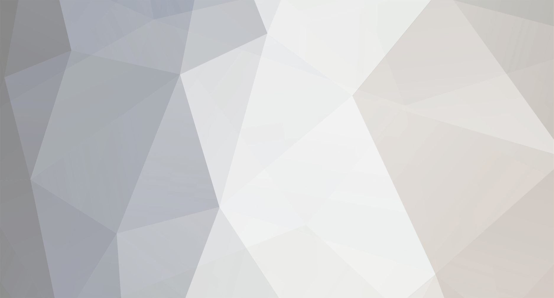
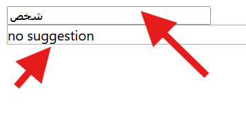
لدي مشكلة في القائمة المنسدلة على الشاشات الكبيرة لا تظهر القائمة لانها مغطاة باللون الابيض
وعلى الشاشات الصغيرة لا يوجد مشكلة لاحظت المشكلة على فايرفوكس
ارفقت صورة للمشكلة :
شكرا على تعاونكم
<div class="field" style="margin-top:10px">
<label>المادة</label>
<select name="tahsili_subject_id" onchange="this.form.submit()">
<option value="">— اختر المادة —</option>
<?php foreach($subjects_tahsili as $s): ?>
<option value="<?= (int)$s['id'] ?>"</option>
<?php endforeach; ?>
</select>
</div>
<?php elseif($section==='qdrat'): ?>
<div class="field" style="margin-top:10px">
<label>قسم القدرات</label>
<select name="qdrat_class_id" onchange="this.form.submit()">
<option value="">— اختر القسم —</option>
<?php foreach($qdrat_classes as $c): ?>
<option value="<?= (int)$c['id'] ?>"</option>
<?php endforeach; ?>
</select>
<style>
:root{
--bg:#0f172a; --surface:#111827; --card:#0b1220; --line:#1f2937;
--ink:#f1f5f9; --muted:#9aa6b2; --primary:#0ea5a6; --accent:#22c55e;
--shadow:0 16px 40px rgba(0,0,0,.45); --btn-ink:#062221;
}
html[data-theme="light"]{
--bg:#f6f7fb; --surface:#ffffff; --card:#ffffff; --line:#d9e0e8;
--ink:#0f172a; --muted:#5b6573; --primary:#0f9da0; --accent:#16a34a;
--shadow:0 16px 40px rgba(0,0,0,.10); --btn-ink:#001b1b;
}
:root{ --font-ar:"IBM Plex Arabic", system-ui, -apple-system, "Segoe UI", Tahoma, Arial, sans-serif; }
/* أساسيات الخط */
html, body{
font-family: var(--font-ar);
-webkit-font-smoothing: antialiased;
-moz-osx-font-smoothing: grayscale;
text-rendering: optimizeLegibility;
}
*, *::before, *::after{ font-family: inherit; }
button, input, select, textarea{ font: inherit; }
a, label, summary, details, small, strong, h1, h2, h3, h4, h5, h6, p, div, span{ font-family: inherit; }
mjx-container{ font-family: var(--font-ar); }
/* الخلفية العامة */
html,body{
background:
radial-gradient(1200px 800px at 80% -10%, rgba(14,165,166,.08), transparent 60%),
radial-gradient(1000px 700px at -10% 110%, rgba(34,197,94,.06), transparent 50%),
var(--bg);
color:var(--ink);
min-height:100dvh;
}
.wrap{ max-width:1200px; margin:0 auto; padding:20px 14px 56px; }
/* مهم: اسمح بتجاوز القوائم المنسدلة */
.wrap, .page-card{ overflow:visible; }
.theme-toggle{ position:fixed; inset-inline-start:14px; inset-block-end:calc(14px + env(safe-area-inset-bottom));
z-index:9999; width:42px; height:42px; border-radius:50%; display:grid; place-items:center; cursor:pointer;
background:var(--card); color:var(--ink); border:1px solid var(--line); box-shadow:var(--shadow); user-select:none; }
.theme-toggle svg{ width:22px; height:22px; pointer-events:none; }
.topbar{ display:flex; align-items:center; justify-content:space-between; gap:12px; margin:8px 0 14px; }
.brand{ display:flex; align-items:center; gap:12px; }
.brand-mark{ width:44px; height:44px; border-radius:12px; background:linear-gradient(135deg, rgba(14,165,166,.25), rgba(34,197,94,.18));
border:1px solid var(--line); display:grid; place-items:center; font-weight:900; color:var(--primary) }
.brand h1{ margin:0; font-size:18px; font-weight:800 }
.brand p{ margin:0; font-size:12px; color:var(--muted) }
.help-link a{ color:var(--btn-ink); background:rgba(14,165,166,.14); border:1px solid rgba(14,165,166,.25);
padding:8px 12px; border-radius:10px; text-decoration:none; font-weight:800; font-size:13px; }
html[data-theme="dark"] .help-link a{ color:#fff; background:rgba(255,255,255,.08); border:1px solid rgba(255,255,255,.15); }
.page-card{
position:relative; /* لسياق التراكب */
background:linear-gradient(180deg, color-mix(in oklab, var(--primary) 10%, transparent), transparent 45%), var(--card);
border:1px solid var(--line); border-radius:16px; padding:16px; box-shadow:var(--shadow);
}
.muted{ color:var(--muted); font-size:12px }
/* أزرار */
.btn{
appearance:none; border:none; cursor:pointer; text-decoration:none;
padding:12px 18px; border-radius:12px; font-weight:800; font-size:14px;
background:var(--primary); color:var(--btn-ink);
box-shadow:0 8px 24px color-mix(in srgb, var(--primary) 30%, transparent);
transition:transform .05s, box-shadow .2s, filter .2s;
display:inline-flex; align-items:center; gap:8px; position:relative; overflow:hidden; transform:translateZ(0);
}
.btn:hover{ filter:brightness(1.05); box-shadow:0 10px 28px color-mix(in srgb, var(--primary) 38%, transparent) }
.btn:active{ transform:translateY(1px) scale(.99) }
.btn-ghost{ background:var(--card); color:var(--ink); border:1px solid var(--line); box-shadow:0 8px 24px rgba(0,0,0,.15); }
.btn .ripple{ position:absolute; border-radius:50%; pointer-events:none; width:12px; height:12px;
transform:translate(-50%,-50%); background:rgba(255,255,255,.45); animation:ripple .6s ease forwards; mix-blend-mode:soft-light; }
@keyframes ripple{ from{opacity:.65; transform:translate(-50%,-50%) scale(1);} to{opacity:0; transform:translate(-50%,-50%) scale(24);} }
.radio-row{ display:flex; gap:12px; flex-wrap:wrap }
.radio-row label{ display:inline-flex; align-items:center; gap:8px; background:var(--surface); border:1px solid var(--line); border-radius:12px; padding:8px 12px; cursor:pointer; }
.form-grid{ display:grid; gap:16px; grid-template-columns: repeat(3, minmax(0,1fr)); align-items:start; }
@media (max-width:880px){ .form-grid{ grid-template-columns:1fr; } }
.field{ min-width:0; position:relative; } /* relative مهم للتراكب */
.field label{ display:block; margin-bottom:8px; font-size:14px; font-weight:800; color:var(--muted); letter-spacing:.2px; }
/* مدخلات وسيلكت – قاعدة موحدة (لا نكررها لاحقًا) */
.field input,
.field select{
width:100%; box-sizing:border-box; display:block;
background:var(--card); border:1px solid var(--line); color:var(--ink);
border-radius:12px; padding:12px 14px; line-height:1.4; font-size:16px;
transition:border-color .15s, box-shadow .15s, background .15s; min-height:44px;
}
@media (max-width:600px){
.field input, .field select{ padding:14px 16px; font-size:16px; }
}
.field input::placeholder{ color: color-mix(in oklab, var(--muted) 80%, transparent); }
.field input:focus, .field select:focus{
outline:none; border-color: color-mix(in oklab, var(--primary) 75%, var(--line));
box-shadow: 0 0 0 3px color-mix(in oklab, var(--primary) 25%, transparent);
background: color-mix(in oklab, var(--card) 92%, transparent);
}
/* عند التركيز، ارفع الحقل فوق كل شيء (لإظهار القائمة) */
@media (min-width:801px){
.field:focus-within{ z-index: 9999; }
}
/* تحسين الـselect: سهم + اتجاه RTL */
.field select{
-webkit-appearance:none; -moz-appearance:none; appearance:none;
background-image:url("data:image/svg+xml;utf8,<svg fill='%239aa6b2' height='20' viewBox='0 0 24 24' width='20' xmlns='http://www.w3.org/2000/svg'><path d='M7 10l5 5 5-5z'/></svg>");
background-repeat:no-repeat;
background-position: left 12px center; /* RTL: السهم يسار */
background-size:20px;
padding-inline-end:36px; /* مساحة للسهم */
}
/* input[type=date] — اعرض القيمة بشكل نظيف في RTL */
.field input[type="date"]{
direction:ltr; text-align:start; -webkit-appearance:none; appearance:none; overflow:hidden;
}
/* أقسام */
.form-section{ margin-top:18px; }
.form-section .section-title{ margin:0 0 10px; font-size:15px; font-weight:900; color:var(--ink); }
.list-head{ display:flex; justify-content:space-between; align-items:center; margin:10px 0 6px }
.box{
border:1px solid var(--line); border-radius:12px; padding:10px;
max-height:340px; overflow:auto; background:var(--card);
position:relative; z-index:1; /* تحت السيلكت عند الفتح */
}
/* على الشاشات الكبيرة إن قصّت القائمة، اسمح لها بالخروج */
@media (min-width:801px){
.box{ overflow:visible; } /* فعّلها فقط لو كانت القائمة تختفي */
}
.chk{ display:flex; gap:8px; align-items:center; margin:4px 0 }
.footer{ margin-top:34px; padding:14px; text-align:center; color:var(--muted); font-size:12px; border-top:1px solid var(--line); }
.footer a{ color:var(--muted); text-decoration:none; }
.actions-row{ display:flex; gap:10px; flex-wrap:wrap; margin-top:10px; }
@media (max-width:600px){ .actions-row .btn, .actions-row .btn-ghost{ width:100%; justify-content:center; } }
.radio-row{ display:flex; gap:12px; flex-wrap:wrap; }
.radio-row label{ flex:1; display:inline-flex; align-items:center; gap:8px; background:var(--surface); border:1px solid var(--line);
border-radius:12px; padding:10px 14px; cursor:pointer; justify-content:center; font-weight:600; box-sizing:border-box; max-width:100%; }
@media (max-width:600px){ .radio-row{ flex-direction:column; } .radio-row label{ width:100%; justify-content:flex-start; } }
</style>