لقد قمت بتمثيل بياناتي، لكن أريد أن أضيف للرسم البياني شبكة grid، كيف نقوم بذلك؟
هذا هو الكود:
import matplotlib.pyplot as plt
import numpy as np
from matplotlib import colors
from matplotlib.ticker importPercentFormatter# إنشاء بيانات عشوائية
N_points =984
n_bins =15# إنشاء توزيع
x = np.random.randn(N_points)
y =.8** x + np.random.randn(984)+25
legend =['distribution']# إنشاء الهيستوغرام
fig, axs = plt.subplots(1,1,
figsize =(10,7),
tight_layout =True)#ticks حذف العلامات
axs.xaxis.set_ticks_position('none')
axs.yaxis.set_ticks_position('none')# إضافة نص للشكل
fig.text(0.9,0.15,'Histogram',
fontsize =13,color ='red',ha ='right',
va ='top',alpha =0.7)# plot حذف خطوط حاويةال for s in['top','bottom','left','right']:
axs.spines[s].set_visible(False)#وضع مسافة بين التسميات وبين المحاور
axs.xaxis.set_tick_params(pad =4)
axs.yaxis.set_tick_params(pad =8)# إنشاء الهستوغرام
N, bins, patches = axs.hist(x, bins = n_bins)# تحديد الألوان
fracs =((N**(9))/ N.max())
norm = colors.Normalize(fracs.min(), fracs.max())for thisfrac, thispatch in zip(fracs, patches):
color = plt.cm.viridis(norm(thisfrac))
thispatch.set_facecolor(color)# تسمية للمحاور
plt.xlabel("X-axis")
plt.ylabel("y-axis")
plt.legend(legend)# عنوان
plt.title('Histogram')# عرض
plt.show()


السؤال
Ali Ismael
لقد قمت بتمثيل بياناتي، لكن أريد أن أضيف للرسم البياني شبكة grid، كيف نقوم بذلك؟
هذا هو الكود:
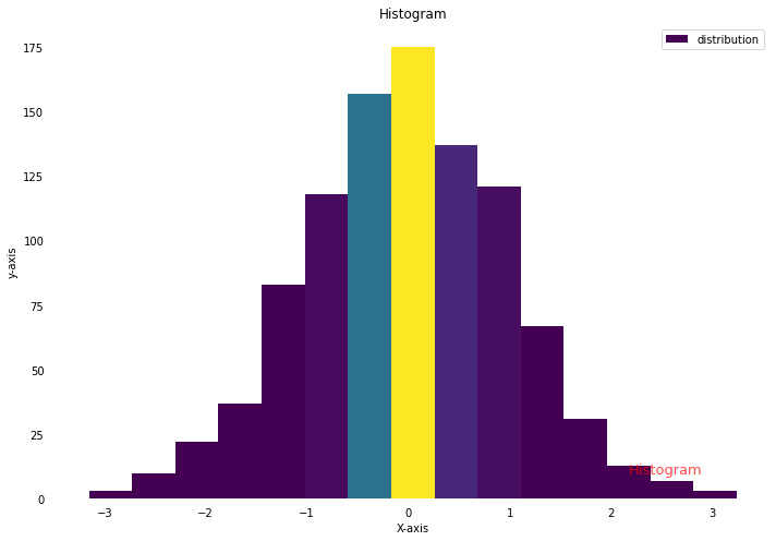
وهذه هي النتيجة:
رابط هذا التعليق
شارك على الشبكات الإجتماعية
2 أجوبة على هذا السؤال
Recommended Posts
انضم إلى النقاش
يمكنك أن تنشر الآن وتسجل لاحقًا. إذا كان لديك حساب، فسجل الدخول الآن لتنشر باسم حسابك.