

في درسنا الرابع من هذه السلسلة، سنتابع الحديث حول الخاصية data-، وربط الصفحات الخارجية، واستخدام نظام الشبكة (grid system)، وبناء محتوى قابل للطي. بالإضافة إلى ذلك، ستتعلم كيف تنشئ تذييل ورأس وشريط تنقل ...إلخ. وكل ذلك مدعوم بأجزاء من شيفرات برمجية عملية.
هذا الدرس جزء من سلسلة دروس تشرح jQuery Mobile:
- الدرس الأول: البداية، بناء وتقديم محتوى
- الدرس الثاني: التضمين، تهيئة الصفحة، التنقل بين الصفحات وأحداث التحميل
- الدرس الثالث: اتجاه الصفحة وأحداثها
- الدرس الرابع: ربط صفحات خارجية وتنظيم المحتوى بنظام الشبكة وبناء محتوى قابل للطي
- الدرس الخامس: الأيقونات والأزرار وإنشاء تنسيقات مخصصة
- الدرس السادس: إنشاء القوائم وتنسيقها وإنشاء نماذج البحث وتسجيل الدخول
الصفحات الخارجية
يتعامل jQuery Mobile مع الصفحات الخارجية أيضًا. فإذا ربطت صفحة منفصلة بدلًا من مُعرِّف عنصر data-role="page" داخل المستند الحالي، سيجري jQuery Mobile إجراء جلب غير متزامن (asynchronous fetch) للصفحة المطلوبة ويدمجها في الصفحة الحالية ليسمح لها بتشغيل دوال إدارة الصفحة.
لإضافة صفحة خارجية إلى الشيفرة البرمجية السابقة، أنشئ ملفًا باسمexpage.html وضمّن الشيفرة الآتية وغيّر الرابط في شيفرة الصفحة الثالثة والذي هو:
<p><a href="#page1" data-role="button">Go back to First Page</a></p>
إلى:
<p><a href="expage.html" data-role="button">Go to external Page</a></p>
مثال 22: ربط صفحة خارجية
<!DOCTYPE html>
<html>
<head>
  <meta charset="utf-8" />
</head>
<body>
  <p>This content will be ignored.</p>
  <!-- Begin Page 4 -->
  <section id="page4" data-role="page">
    <header data-role="header">
      <h1>jQuery Mobile</h1>
    </header>
    <div class="content" data-role="content">
      <p>External Page!</p>
      <p><a href="#page1" data-role="button">Go to First Page</a>.</p>
    </div>
    <footer data-role="footer">
      <h1>footer</h1>
    </footer>
  </section>
  <!-- End Page 4-->
  <h3>This content will be ignored as well.</h3>
</body>
</html>
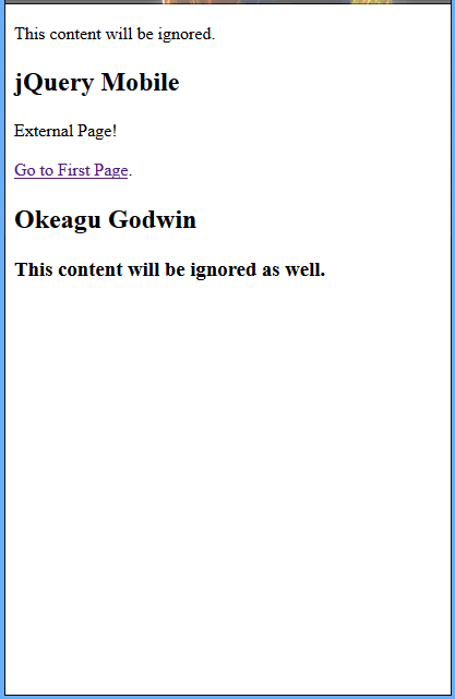
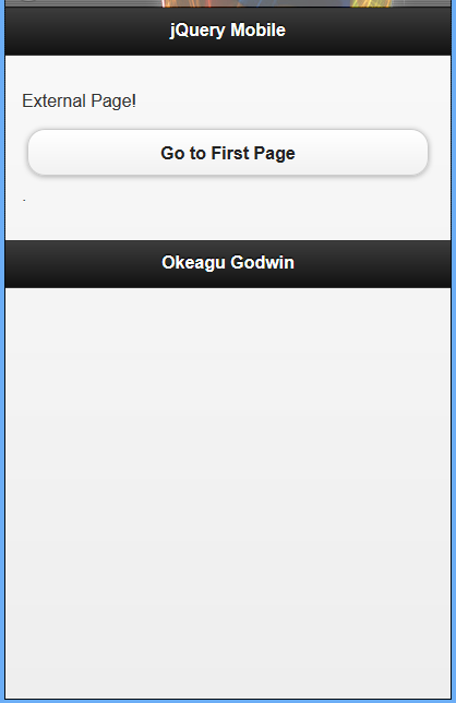
عند معاينة هذا السكربت، سترى الصورة الأولى؛ ولكن عند الانتقال من الصفحة السابقة للسكربت السابق، ستظهر لك الصورة الثانية.
تجاوز جلب الصفحة غير المتزامن
ستحتاج في بعض الأحيان إلى تحميل الصفحة بشكل طبيعي بدلًا من جعل jQuery Mobile يجلبه بشكل غير متزامن ويُضمّنه إلى DOM الحالي. يمكنك تجاوز تحميل AJAX بطريقتين: تحديد الخاصية الهدف على الرابط (مثل "_blank") أو بتحديد الخاصية rel="external" على الرابط.
رصف المحتوى في شبكة
الشبكة (grid) هي أداة لتنظيم الكائنات، ويستخدم jQuery Mobile النظام الشبكي لمساعدتك في رصف المحتوى؛ هذا النظام مفيد لأنه يساعدك على إنشاء صفحات متجاوبة مع عدة أجهزة وبذلك لست يأخذ هذا النظام على عاتقه تخمين كيفية عرض الصفحة على الأجهزة ذات الأحجام المختلفة بالشكل الذي خططت له.
يسمح لك النظام الشبكي في jQuery Mobile بإنشاء أعمدة متساوية العرض. ولتطبيق نظام الشبكة (grid) على المحتوى، ستحتاج إلى إضافة صنف إلى الحاوية التي تريد استخدام الشبكة (grid) فيها، وصنف ثانوي إلى العناصر داخل الحاوية.
أصناف حاوية الشبكة هي:
-
ui-grid-a: تنشئ شبكة من عمودين. -
ui-grid-b: تنشئ شبكة من 3 أعمدة. -
ui-grid-c: تنشئ شبكة من 4 أعمدة. -
ui-grid-d: تنشئ شبكة من 5 أعمدة.
أصناف المحتوى هي:
-
ui-block-a: تُستخدم على الكتلة الأولى. -
ui-block-b: تُستخدم على الكتلة الثانية. -
ui-block-c: تُستخدم على الكتلة الثالثة. -
ui-block-d: تُستخدم على الكتلة الرابعة. -
ui-block-e: تُستخدم على الكتلة الخامسة.
عند استخدام شبكة على حاوية ذات عناصر بمحتوى أعرض من دقة الشاشة، سيُنقل المحتوى إلى صف جديد في الشبكة. هذا يساعد بقاء المحتوى منظم وقابل للعرض على مختلف الأجهزة متفاوتة العرض.
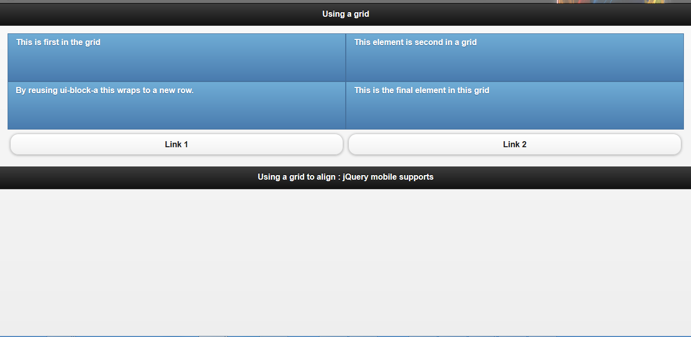
مثال 23: تنظيم المحتوى عن طريق سطر الشبكة
يشرح المثال كيفية ترصيف الأزرار وصناديق المحتوى على الصفحة باستخدام الشبكة.
<!DOCTYPE html>
<html>
<head>
  <title>Script-Tutorials: Using a grid</title>
  <meta name="viewport" content="width=device-width, initial-scale=1">
  <link rel="stylesheet" href="http://code.jquery.com/mobile/1.1.0/jquery.mobile-1.1.0.min.css" />
  <script src="http://code.jquery.com/jquery-1.7.1.min.js"></script>
  <script src="http://code.jquery.com/mobile/1.1.0/jquery.mobile-1.1.0.min.js"></script>
</head>
<body>
  <div id="page1" data-role="page">
    <div data-role="header">
      <h1>Using a grid</h1>
    </div>
    <div data-role="content">
      <div class="ui-grid-a">
        <div class="ui-block-a">
          <p class="ui-bar ui-bar-b" style="height: 80px;">
            This is first in the grid
          </p>
        </div>
        <div class="ui-block-b">
          <p class="ui-bar ui-bar-b" style="height: 80px;">
            This element is second in a grid
          </p>
        </div>
        <div class="ui-block-a">
          <p class="ui-bar ui-bar-b" style="height: 80px;">
            By reusing ui-block-a this wraps to a new row.
          </p>
        </div>
        <div class="ui-block-b">
          <p class="ui-bar ui-bar-b" style="height: 80px;">
            This is the final element in this grid
          </p>
        </div>
      </div>
      <div class="ui-grid-a">
        <div class="ui-block-a">
          <a href="#" data-role="button">Link 1</a>
        </div>
        <div class="ui-block-b">
          <a href="#" data-role="button">Link 2</a>
        </div>
      </div>
    </div>
    <div data-role="footer">
      <h4>Using a grid to align : jQuery mobile supports</h4>
    </div>
  </div>
</body>
</html>
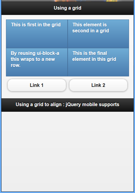
ستعرض الأجهزة الأكبر محتوى منظم في الشبكة، إذ سيتمدد المحتوى للاستفادة من مساحة الشاشة آنذاك.
التخطيطات الشبكية
كما هو موضح في المثال السابق أعلاه، تخطيط الشبكة يعتمد على بنية div: أنشئ عنصر div لاحتواء الشبكة، ومن ثم أضف الخلية داخلها المتمثلة بعناصر div أيضًا.
يُتعامل مع الصفوف المتعددة عن طريق إضافة المزيد من خلايا div والتي يجب أن تُصنَّف ليكون لكل عمود الصنف ui-block الخاص به.
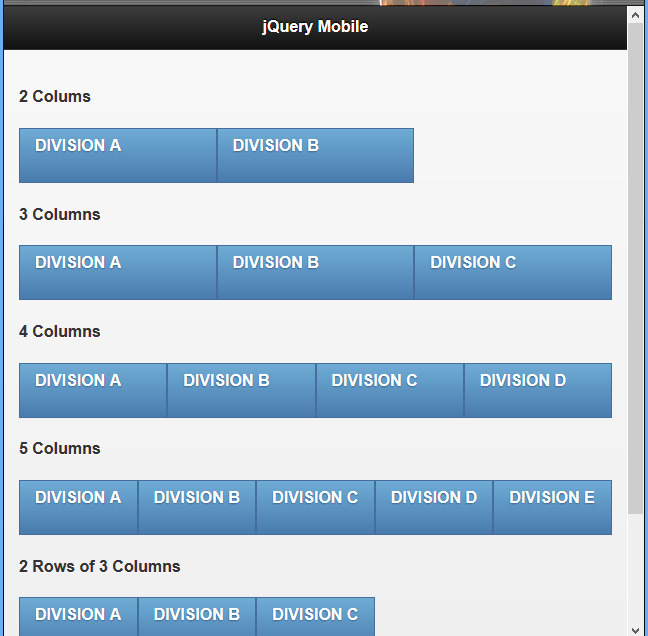
يأخذ العنصر div الحاوي صنفًا يبدأ بـ ui-grid: الصنف ui-grid-a لإنشاء شبكة من عمودين، و ui-grid-b لإنشاء شبكة من ثلاثة أعمدة، وهكذا حتى ui-grid-d لشبكة مؤلفة من خمسة أعمدة.
تأخذ الخلية المتمثلة بعناصر div صنفًا يبدأ بـ ui-block بناءً على ترتيبها: الصنف ui-block-a للخلية الأولى، والصنف ui-block-b للخلية الثانية، وهكذا حتى الصنف ui-block-e للخلية الخامسة.
المثال 24: تخطيط شبكة في موقع مخصص للهاتف باستخدام jQuery mobile
<!DOCTYPE html>
<html>
<head>
  <title>Script-tutorials: Grid layout with jQuery Mobile</title>
  <meta name="viewport" content="width=device-width, initial-scale=1">
  <link rel="stylesheet" href="http://code.jquery.com/mobile/1.1.0/jquery.mobile-1.1.0.min.css" />
  <script src="http://code.jquery.com/jquery-1.7.1.min.js"></script>
  <script src="http://code.jquery.com/mobile/1.1.0/jquery.mobile-1.1.0.min.js"></script>
</head>
<body>
  <section id="page1" data-role="page">
    <header data-role="header">
      <h1>jQuery Mobile</h1>
    </header>
    <div class="content" data-role="content">
      <h4>2 Colums</h4>
      <div class="ui-grid-b">
        <div class="ui-block-a">
          <p class="ui-bar ui-bar-b" style="height: 40px;">DIVISION A</p>
        </div>
        <div class="ui-block-b">
          <p class="ui-bar ui-bar-b" style="height: 40px;">DIVISION B</p>
        </div>
      </div>
      <h4>3 Columns</h4>
      <div class="ui-grid-b">
        <div class="ui-block-a">
          <p class="ui-bar ui-bar-b" style="height: 40px;">DIVISION A</p>
        </div>
        <div class="ui-block-b">
          <p class="ui-bar ui-bar-b" style="height: 40px;">DIVISION B</p>
        </div>
        <div class="ui-block-c">
          <p class="ui-bar ui-bar-b" style="height: 40px;">DIVISION C</p>
        </div>
      </div>
      <h4>4 Columns</h4>
      <div class="ui-grid-c">
        <div class="ui-block-a">
          <p class="ui-bar ui-bar-b" style="height: 40px;">DIVISION A</p>
        </div>
        <div class="ui-block-b">
          <p class="ui-bar ui-bar-b" style="height: 40px;">DIVISION B</p>
        </div>
        <div class="ui-block-c">
          <p class="ui-bar ui-bar-b" style="height: 40px;">DIVISION C</p>
        </div>
        <div class="ui-block-d">
          <p class="ui-bar ui-bar-b" style="height: 40px;">DIVISION D</p>
        </div>
      </div>
      <h4>5 Columns</h4>
      <div class="ui-grid-d">
        <div class="ui-block-a">
          <p class="ui-bar ui-bar-b" style="height: 40px;">DIVISION A</p>
        </div>
        <div class="ui-block-b">
          <p class="ui-bar ui-bar-b" style="height: 40px;">DIVISION B</p>
        </div>
        <div class="ui-block-c">
          <p class="ui-bar ui-bar-b" style="height: 40px;">DIVISION C</p>
        </div>
        <div class="ui-block-d">
          <p class="ui-bar ui-bar-b" style="height: 40px;">DIVISION D</p>
        </div>
        <div class="ui-block-e">
          <p class="ui-bar ui-bar-b" style="height: 40px;">DIVISION E</p>
        </div>
      </div>
      <h4>2 Rows of 3 Columns</h4>
      <div class="ui-grid-d">
        <div class="ui-block-a">
          <p class="ui-bar ui-bar-b" style="height: 40px;">DIVISION A</p>
        </div>
        <div class="ui-block-b">
          <p class="ui-bar ui-bar-b" style="height: 40px;">DIVISION B</p>
        </div>
        <div class="ui-block-c">
          <p class="ui-bar ui-bar-b" style="height: 40px;">DIVISION C</p>
        </div>
      </div>
    </div>
    <footer data-role="footer">
      <h1>Alignment Grid-layou</h1>
    </footer>
  </section>
</body>
</html>
بناء محتوى قابل للطي
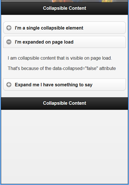
يمكن أن يكون المحتوى القابل للطي مخفيًا أو ظاهرًا مع وجود زر أو إمكانية لمسه لتغيير حالته (طيِّه إن كان مفتوحًا أو فتحه إن كان مطويًّا). ربما قد رأيت هذا النوع من السلوك على مواقع ويب أخرى سابقًا، خصوصًا في أقسام الأسئلة الشائعة.
يكون عنوان الأسئلة والأجوبة غالبًا في مثل تلك المواقع ظاهرًا مع وجود زر مثل + أو - بجانبه للإِشارة إلى أنه يمكنك إظهار المحتوى وإخفاؤه. نفس هذه الوظيفة موجودة في jQuery Mobile. لإنشاء محتوى قابل للطي، إذ ستحتاج إلى إضافة الخاصية data-role="collapsible" إلى العنصر الحاوي للعنصر الذي تريد جعله قابلًا للطي.
المثال 25: بناء محتوى قابل للطي
<!DOCTYPE html>
<html>
<head>
  <title>Script-tutorials: Collapsible Content</title>
  <meta name="viewport" content="width=device-width, initial-scale=1">
  <link rel="stylesheet" href="http://code.jquery.com/mobile/1.1.0/jquery.mobile-1.1.0.min.css" />
  <script src="http://code.jquery.com/jquery-1.7.1.min.js"></script>
  <script src="http://code.jquery.com/mobile/1.1.0/jquery.mobile-1.1.0.min.js"></script>
</head>
<body>
  <div id="page1" data-role="page">
    <div data-role="header">
      <h1>Collapsible Content</h1>
    </div>
    <div data-role="content">
      <div data-role="collapsible">
        <h3>I'm a single collapsible element</h3>
        <p>I'm the content inside of the single collapsible element.</p>
      </div>
      <div data-role="collapsible-set">
        <div data-role="collapsible" data-collapsed="false">
          <h3>I'm expanded on page load</h3>
          <p>I am collapsible content that is visible on page load.</p>
          <p>That's because of the data-collapsed="false" attribute</p>
        </div>
        <div data-role="collapsible">
          <h3>Expand me I have something to say</h3>
          <p>I am closed on page load, but still part of an accordion.</p>
          <div data-role="collapsible">
            <h3>Wait, are you nested?</h3>
            <p>Yes! You can even nest your collapsible content!</p>
          </div>
        </div>
      </div>
    </div>
    <div data-role="footer">
      <h4>Collapsible Content</h4>
    </div>
  </div>
</body>
</html>
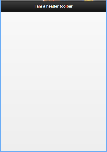
إضافة شريط أدوات في ترويسة الصفحة
مثال 26: إعداد الترويسة
<!DOCTYPE html>
<html>
<head>
  <title>Script-tutorials: Header toolbar</title>
  <meta name="viewport" content="width=device-width, initial-scale=1">
  <link rel="stylesheet" href="http://code.jquery.com/mobile/1.1.0/jquery.mobile-1.1.0.min.css" />
  <script src="http://code.jquery.com/jquery-1.7.1.min.js"></script>
  <script src="http://code.jquery.com/mobile/1.1.0/jquery.mobile-1.1.0.min.js"></script>
</head>
<body>
  <div data-role="page">
    <div data-role="header">
      <h1>I am a header toolbar</h1>
    </div>
  </div>
</body>
</html>
مثال 27: إضافة زر إلى ترويسة الصفحة
<!DOCTYPE html>
<html>
<head>
  <title>Script-tutorials: Header toolbar</title>
  <meta name="viewport" content="width=device-width, initial-scale=1">
  <link rel="stylesheet" href="http://code.jquery.com/mobile/1.1.0/jquery.mobile-1.1.0.min.css" />
  <script src="http://code.jquery.com/jquery-1.7.1.min.js"></script>
  <script src="http://code.jquery.com/mobile/1.1.0/jquery.mobile-1.1.0.min.js"></script>
</head>
<body>
  <div data-role="page">
    <div data-role="header" data-position="inline">
      <!-- first link -->
      <a href="#">Purchase</a>
      <h1>I am a header toolbar</h1>
      <!--second link -->
      <a href="#">Apply</a>
    </div>
  </div>
</body>
</html>
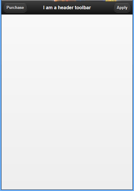
لاحظ أنه لا يتوجب علينا تطبيق الخاصية data-role لتنسيق الرابط مثل حالة الأزرار. سيكون تنسيق الرابط مثل الزر تلقائيًا عند وضعه داخل شريط أدوات الترويسة (header toolbar).
افتراضيًا، يُعرَض الرابط الأول في شريط أدوات الترويسة على الجانب الأيسر من الشريط.
إرفاق شريط أدوات للتنقل
شريط أدوات التنقل (navigation toolbar أو navbar)، هي ودجة (widget) موجودة في jQuery Mobile، تسمح لك بإضافة أزرار تنقل إلى صفحتك.
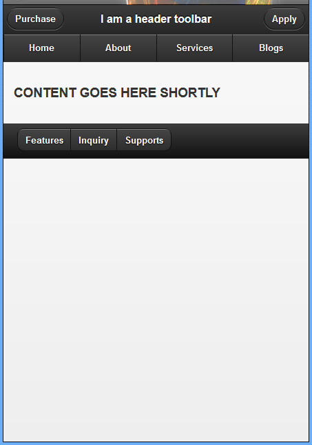
مثال 28: صفحة مع شريط تنقل داخل شريط أدوات ترويسة الصفحة
<!DOCTYPE html>
<html>
<head>
  <title>Script-tutorials: Header toolbar</title>
  <meta name="viewport" content="width=device-width, initial-scale=1">
  <link rel="stylesheet" href="http://code.jquery.com/mobile/1.1.0/jquery.mobile-1.1.0.min.css" />
  <script src="http://code.jquery.com/jquery-1.7.1.min.js"></script>
  <script src="http://code.jquery.com/mobile/1.1.0/jquery.mobile-1.1.0.min.js"></script>
</head>
<body>
  <div data-role="page">
    <div data-role="header" data-position="inline">
      <!-- first link -->
      <a href="#">Purchase</a>
      <h1>I am a header toolbar</h1>
      <!--second link -->
      <a href="#">Apply</a>
      <div data-role="navbar">
        <ul>
          <li><a href="#">Home</a>
          </li>
          <li><a href="#">About</a>
          </li>
          <li><a href="#">Services</a>
          </li>
          <li><a href="#">Blogs</a>
          </li>
        </ul>
      </div>
    </div>
  </div>
</body>
</html>

تُنشَأ حاوية شريط التنقل كعنصر div مع الخاصية data-role="navbar". لاحظ كيف أنَّ شريط التنقل مرتبط بشريط أدوات ترويسة الصفحة من خلال إنشائه داخله.
سيحتوي العنصر ul على جميع الروابط التي نريد وضعها داخل شريط التنقل والتي تكون ضمن عناصر li.
إضافة شريط أدوات الذيل
تمامًا مثل شريط أدوات الترويسة، يمكنك إضافة شريط أدوات الذيل عن طريق إضافة الخاصية data-role="footer" إلى حاوية العنصر.
إليك جزء من شيفرة برمجية لإعداد شريط أدوات الصفحة:
<div data-role="footer">
<h4>I am a footer toolbar</h4>
</div>
يجب أن يكون هذا الجزء مألوفًا لك إذ يشبه شريط أدوات الترويسة الذي تحدثنا عنه قبل قليل. لنقم بشيء جديد ونغيّر في شريط الأدوات الذيل عن طريق حذف العنصر h4 واستبداله ببعض الأزرار.
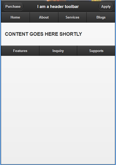
مثال 29: إضافة وتنظيم الأزرار باستخدام مجموعة التحكم في ذيل الصفحة
<!DOCTYPE html>
<html>
<head>
  <title>Script-tutorials: Header toolbar</title>
  <meta name="viewport" content="width=device-width, initial-scale=1">
  <link rel="stylesheet" href="http://code.jquery.com/mobile/1.1.0/jquery.mobile-1.1.0.min.css" />
  <script src="http://code.jquery.com/jquery-1.7.1.min.js"></script>
  <script src="http://code.jquery.com/mobile/1.1.0/jquery.mobile-1.1.0.min.js"></script>
</head>
<body>
  <div data-role="page">
    <div data-role="header" data-position="inline">
      <!-- first link -->
      <a href="#">Purchase</a>
      <h1>I am a header toolbar</h1>
      <!--second link -->
      <a href="#">Apply</a>
      <div data-role="navbar">
        <ul>
          <li><a href="#">Home</a>
          </li>
          <li><a href="#">About</a>
          </li>
          <li><a href="#">Services</a>
          </li>
          <li><a href="#">Blogs</a>
          </li>
        </ul>
      </div>
    </div>
    <!--content -->
    <div data-role="content">
      <h3>CONTENT GOES HERE SHORTLY</h3>
    </div>
    <!--adding footer to your page with tool bar -->
    <div data-role="footer" class="ui-bar">
      <div data-role="controlgroup" data-type="horizontal">
        <a href="#" data-role="button">Features</a>
        <a href="#" data-role="button">Inquiry</a>
        <a href="#" data-role="button">Supports</a>
      </div>
    </div>
  </div>
</body>
</html>
مثال 30: رصف الأزرار في شريط الأدوات في ذيل الصفحة
يمكن استخدام خيارين لرصف الأزرار في شريط الأدوات في ذيل الصفحة:
- رصف المحتوى باستخدام الشبكة (grid):
<div data-role="footer" class="ui-bar">
  <div class="ui-grid-b">
    <div class="ui-block-a"><a href="#" data-role="button">Features</a>
    </div>
    <div class="ui-block-b"><a href="#" data-role="button">Inquiry</a>
    </div>
    <div class="ui-block-c"><a href="#" data-role="button">Supports</a>
    </div>
  </div>
</div>
- رصف المحتوى باستخدام مجموعة التحكم:
<div data-role="footer" class="ui-bar">
  <div data-role="controlgroup" data-type="horizontal">
    <a href="#" data-role="button">Features</a>
    <a href="#" data-role="button">Inquiry</a>
    <a href="#" data-role="button">Supports</a>
  </div>
</div>
مثال 31: استخدام شريط التنقل في شريط أدوات ذيل الصفحة
<!DOCTYPE html>
<html>
<head>
  <title>Script-tutorials: Header toolbar</title>
  <meta name="viewport" content="width=device-width, initial-scale=1">
  <link rel="stylesheet" href="http://code.jquery.com/mobile/1.1.0/jquery.mobile-1.1.0.min.css" />
  <script src="http://code.jquery.com/jquery-1.7.1.min.js"></script>
  <script src="http://code.jquery.com/mobile/1.1.0/jquery.mobile-1.1.0.min.js"></script>
</head>
<body>
  <div data-role="page">
    <div data-role="header" data-position="inline">
      <!-- first link -->
      <a href="#">Purchase</a>
      <h1>I am a header toolbar</h1>
      <!--second link -->
      <a href="#">Apply</a>
      <div data-role="navbar">
        <ul>
          <li><a href="#">Home</a>
          </li>
          <li><a href="#">About</a>
          </li>
          <li><a href="#">Services</a>
          </li>
          <li><a href="#">Blogs</a>
          </li>
        </ul>
      </div>
    </div>
    <!--content -->
    <div data-role="content">
      <h3>CONTENT GOES HERE SHORTLY</h3>
    </div>
    <!--adding footer to your page with tool bar -->
    <div data-role="footer">
      <div data-role="navbar">
        <ul>
          <li><a href="#">Features</a>
          </li>
          <li><a href="#">Inquiry</a>
          </li>
          <li><a href="#">Supports</a>
          </li>
        </ul>
      </div>
    </div>
  </div>
</body>
</html>
شريط التنقل (navbar) هي ودجة موجودة في jQuery Mobile تسمح لك بإضافة روابط تنقل في صفحتك، وعلى غرار نظام الشبكة المدمج، فإن شريط التنقل قادر على احتواء خمسة أعمدة. ولإضافة شريط التنقل إلى صفحتك، يجب عليك استخدام عنصر الحاوية مع الخاصية data-role="navbar". يجب أن يكون لديك داخل الحاوية قائمة غير مرتبة ul مع كل عمود داخل عنصر li.
تموضع أشرطة الأدوات
تُوضع أشرطة الأدوات في العادة قبل وبعد قسم المحتوى، وهذا معيارٌ في تطوير الويب. في بعض الأحيان، قد تريد إبقاء رأس وذيل الصفحة مرئيًّا دائمًا، خاصة عند استخدام شريط التنقل (navbar)، وتوجد طريقتين لفعل هذا. يمكنك إما استخدام تموضع شريط الأدوات الثابت أو تملئ به الشاشة.
التموضع الثابت
عند استخدام موضع ثابت، سيتحقق jQuery Mobile من الصفحة لمعرفة هل شريط الأدوات ظاهر في العرض أم لا، فإذا كان شريط الأدوات خارج العرض، فسيُدرج في أعلى الصفحة أو أسفلها (بالاعتماد على ما إذا كان شريط الأدوات في رأس أو ذيل الصفحة) ليكون ظاهرًا للمستخدم.
لجعل شريط الأدوات يستخدم الموضع الثابت، تحتاج إلى إضافة الخاصية data-position="fixed" إلى شريط الأدوات.
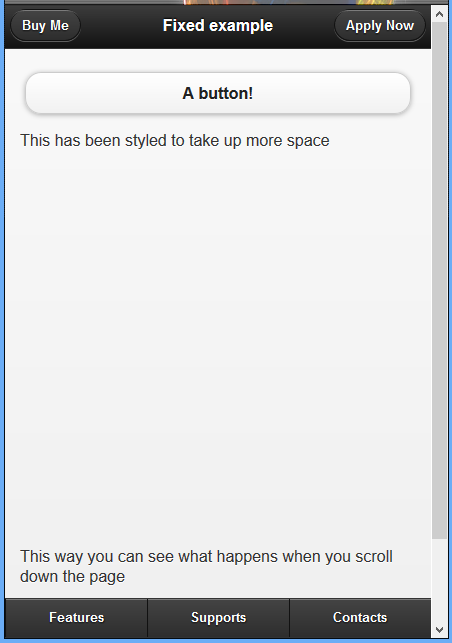
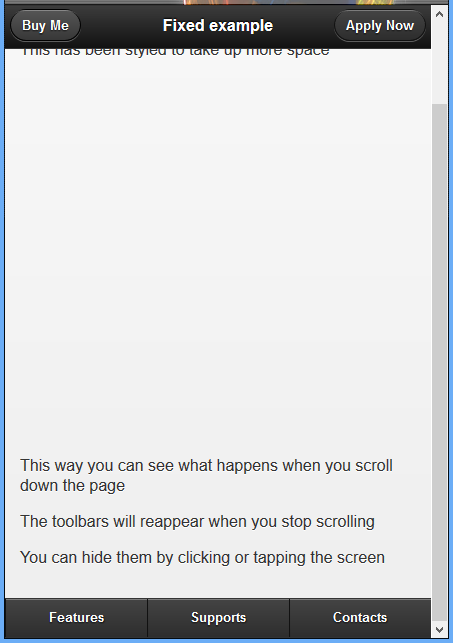
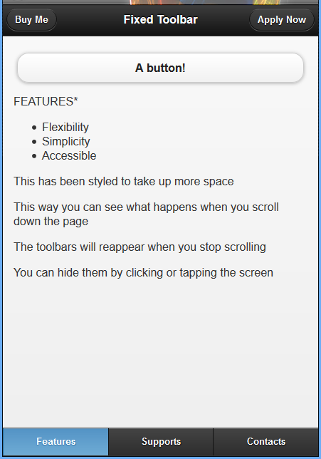
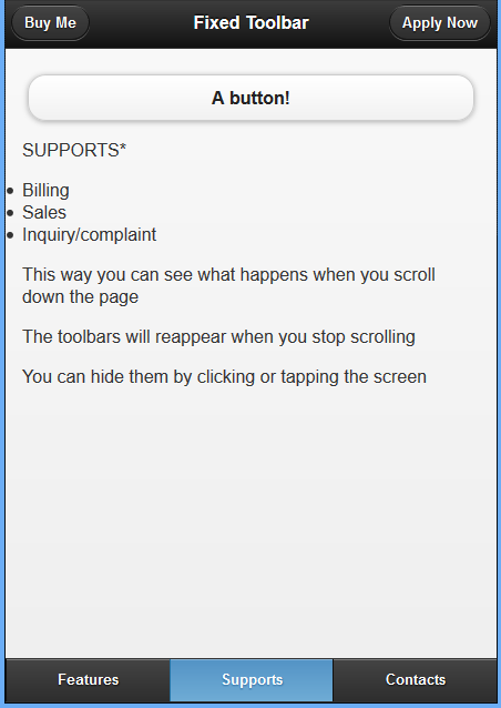
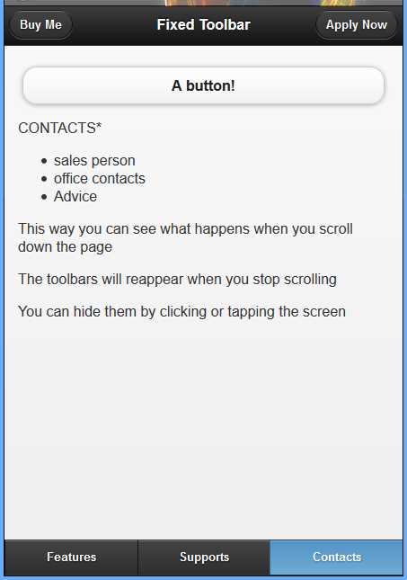
مثال 31: شريط الأدوات الثابت
شكل صفحة HTML قبل التمرير إلى الأسفل:
شكل صفحة HTML بعد التمرير إلى الأسفل:
شيفرة HTML هي:
<!DOCTYPE html>
<html>
<head>
  <title>Script-tutorials: Toolbars with jQuery Mobile</title>
  <meta name="viewport" content="width=device-width, initial-scale=1">
  <link rel="stylesheet" href="http://code.jquery.com/mobile/1.1.0/jquery.mobile-1.1.0.min.css" />
  <script src="http://code.jquery.com/jquery-1.7.1.min.js"></script>
  <script src="http://code.jquery.com/mobile/1.1.0/jquery.mobile-1.1.0.min.js"></script>
</head>
<body>
  <div data-role="page">
    <div data-role="header" data-position="fixed">
      <a href="#">Buy Me</a>
      <h1>Fixed example</h1><a href="#">Apply Now</a>
    </div>
    <div data-role="content">
      <a href="#" data-role="button">A button!</a>
      <p style="height: 400px;">This has been styled to take up more space</p>
      <p>This way you can see what happens when you scroll down the page</p>
      <p>The toolbars will reappear when you stop scrolling</p>
      <p>You can hide them by clicking or tapping the screen</p>
    </div>
    <div data-role="footer" data-position="fixed">
      <div data-role="navbar">
        <ul>
          <li><a href="#">Features</a>
          </li>
          <li><a href="#">Supports</a>
          </li>
          <li><a href="#">Contacts</a>
          </li>
        </ul>
      </div>
    </div>
  </div>
</body>
</html>
وضع ملئ الشاشة
يرتبط وضع ملئ الشاشة كثيرًا بالوضع الثابت، والفرق الرئيسي هو وضع الشريط فوق الصفحة بدلًا من أن يكونوا جزءًا منها. يمكن أن ينشئ هذا بعض مشاكل التنقل كالروابط التي قد تكون متاحة في أسفل أو أعلى الصفحة من الأشرطة التي هي الآن تحتهم مباشرة.
من الجيد استخدام وضع ملئ الشاشة عند عرض معرض صور أو مقاطع فيديو. في هذه الأمثلة، يمكن وضع عناصر التحكم في شريط التنقل، مما يُتيح للمستخدم فتح وإغلاق عناصر التحكم عند الحاجة.
ستحتاج إلى إضافة الخاصية data-fullscreen="true" إلى عنصر div الذي يملك أيضا الخاصية data-role="page" لاستخدام وضع ملئ الشاشة. ويجب عليك التأكد من أن كل من أشرطة أدوات ترويسة وذيل الصفحة تحتوي على data-position="fixed".
يجب علينا تغيير هذا السطر من التعليمات البرمجية السابقة <div data-role="page"> إلى هذا السطر <div data-role="page" data-fullscreen="true">
مثال 32: شريط أدوات في وضع ملئ الشاشة
<!DOCTYPE html>
<html>
<head>
  <title>Script-tutorials: Toolbars with jQuery Mobile</title>
  <meta name="viewport" content="width=device-width, initial-scale=1">
  <link rel="stylesheet" href="http://code.jquery.com/mobile/1.1.0/jquery.mobile-1.1.0.min.css" />
  <script src="http://code.jquery.com/jquery-1.7.1.min.js"></script>
  <script src="http://code.jquery.com/mobile/1.1.0/jquery.mobile-1.1.0.min.js"></script>
</head>
<body>
  <div data-role="page" data-fullscreen="true">
    <div data-role="header" data-position="fixed">
      <a href="#">Buy Me</a>
      <h1>Full Screen </h1><a href="#">Apply Now</a>
    </div>
    <div data-role="content">
      <a href="#" data-role="button">A button!</a>
      <p style="height: 400px;">This has been styled to take up more space</p>
      <p>This way you can see what happens when you scroll down the page</p>
      <p>The toolbars will reappear when you stop scrolling</p>
      <p>You can hide them by clicking or tapping the screen</p>
    </div>
    <div data-role="footer" data-position="fixed">
      <div data-role="navbar">
        <ul>
          <li><a href="#">Features</a>
          </li>
          <li><a href="#">Supports</a>
          </li>
          <li><a href="#">Contacts</a>
          </li>
        </ul>
      </div>
    </div>
  </div>
</body>
</html>
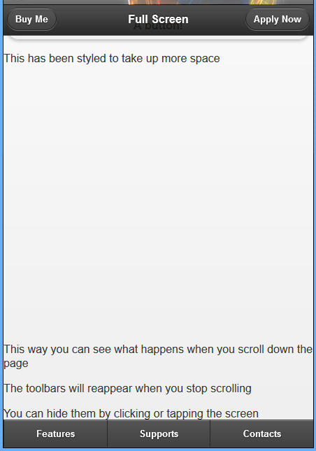
تذكر أنَّه يمكن الوصول إلى العناصر التي تغطيها أشرطة الأدوات عند استخدام وضع ملئ الشاشة عن طريق الضغط أو لمس في مكان ما على الشاشة لإخفاء الشريط.
إضافة تنقل مستمر
ليكن لدينا عنصر div مع الخاصيات data-role="footer"، و data-position="fixed" و data-id="rps"، أول خاصيتين مطلوبتين لإنشاء شريط أدوات الذيل واستخدام التموضع الثابت، وأما بالنسبة للخاصية data-id=”rps” فهي ستُبقِي شريط التنقل ظاهرًا أثناء التنقل بين الصفحات. ويعمل هذا فقط عندما تكون القيمة داخل الخاصية data-id هي نفسها في الصفحة الحالية التي ستنتقل إليها.
مثال 31: إضافة تنقل مستمر
معاينة الصفحة features.html:
الانتقال إلى الصفحة supports.html:
الانتقال إلى الصفحة contacts.html:
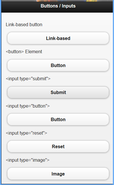
المدخلات والأزرار
تُنشئ العديد من أنواع عناصر الإدخال في HTML أزرارًا. في أي وقت تستخدم فيه عنصر إدخال مع الخاصية type مضبوطةً إلى إحدى القيم: submit، أو reset، و button، أو image، سيتحول عنصر الإدخال تلقائيًا إلى زر.
بما أن أنواع المدخلات هذه تتحول تلقائيًا إلى أزرار، لا تحتاج إلى إضافة الخاصية data-role="button" كما فعلت عند استخدام زر ذي رابط؛ فقط في حالة كنت تتساءل، يتحول عنصر الزر أيضًا تلقائيًا إلى نمط زر ولا يتطلب أي شيفرة إضافية.
مثال 32: المدخلات والأزرار (عناصر النموذج)
<!DOCTYPE html>
<html>
<head>
  <title>Script-tutorials: Buttons jQuery Mobile</title>
  <meta name="viewport" content="width=device-width, initial-scale=1">
  <link rel="stylesheet" href="http://code.jquery.com/mobile/1.1.0/jquery.mobile-1.1.0.min.css" />
  <script src="http://code.jquery.com/jquery-1.7.1.min.js"></script>
  <script src="http://code.jquery.com/mobile/1.1.0/jquery.mobile-1.1.0.min.js"></script>
</head>
<body>
  <div data-role="page">
    <div data-role="header">
      <h1>Buttons / Inputs</h1>
    </div>
    <div data-role="content">
      <p>Link-based button</p>
      <a href="#" data-role="button">Link-based</a>
      <p><button> Element</p>
      <button type="button">Button</button>
      <p><input type="submit"></p>
      <input type="submit" value="Submit" />
      <p><input type="button"></p>
      <input type="button" value="Button" />
      <p><input type="reset"></p>
      <input type="reset" value="Reset" />
      <p><input type="image"></p>
      <input type="image" value="Image" />
    </div>
  </div>
</body>
</html>
تجاوز التنسيق الافتراضي للزر
بشكل افتراضي، تملك الأزرار مظهرًا معينًا افتراضيًّا. لمَّا كان الزر يظهر بشكل جيد في أغلب الهواتف والأجهزة المحمولة، فإنه قد يظهر بمظهر غير جميل عندما يقترن بتصميمك. لحسن حظنا، يمكننا تحسين جمالية الزر يدويًّا.
المثال 33: إنشاء أزرار مع زوايا مدورة ومربعة
<!DOCTYPE html>
<html>
<head>
  <title>Script-tutorials: Buttons jQuery Mobile</title>
  <meta name="viewport" content="width=device-width, initial-scale=1">
  <link rel="stylesheet" href="http://code.jquery.com/mobile/1.1.0/jquery.mobile-1.1.0.min.css" />
  <script src="http://code.jquery.com/jquery-1.7.1.min.js"></script>
  <script src="http://code.jquery.com/mobile/1.1.0/jquery.mobile-1.1.0.min.js"></script>
</head>
<body>
  <div data-role="page">
    <div data-role="header">
      <h1>Buttons</h1>
    </div>
    <div data-role="content">
      <a href="#" data-role="button" data-corners="false">Squared</a>
      <a href="#" data-role="button">Rounded</a>
      <a href="#" data-role="button" data-corners="false">Squared</a>
    </div>
  </div>
</body>
</html>
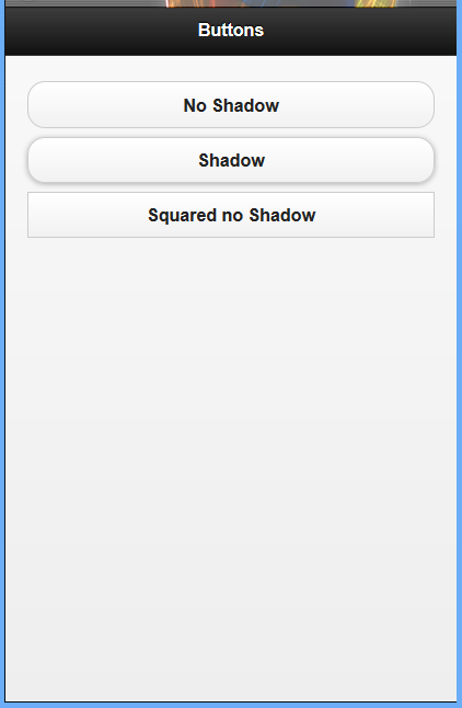
إزالة الظل من الأزرار
هنالك خيار آخر قد ترغب في تغييره وهو مظهر الظل أسفل الزر. يمكن تغيير هذا باستخدام الخاصية data-shadow="false". لا تقتصر على استخدام خاصية data واحدة فقط لكل عنصر، بل يمكنك الجمع بينها للحصول على تنسيقات مختلفة.
المثال34: تغيير مظهر الزر مع الخاصية data
<!DOCTYPE html>
<html>
<head>
  <title>Script-tutorials: Buttons jQuery Mobile</title>
  <meta name="viewport" content="width=device-width, initial-scale=1">
  <link rel="stylesheet" href="http://code.jquery.com/mobile/1.1.0/jquery.mobile-1.1.0.min.css" />
  <script src="http://code.jquery.com/jquery-1.7.1.min.js"></script>
  <script src="http://code.jquery.com/mobile/1.1.0/jquery.mobile-1.1.0.min.js"></script>
</head>
<body>
  <div data-role="page">
    <div data-role="header">
      <h1>Buttons</h1>
    </div>
    <div data-role="content">
      <a href="#" data-role="button" data-shadow="false">No Shadow</a>
      <a href="#" data-role="button">Shadow</a>
      <a href="#" data-role="button" data-corners="false" data-shadow="false">Squared no Shadow</a>
    </div>
  </div>
</body>
</html>
تغيير حجم الزر
عندما أنشأنا سابقًا الزر، لم نقلق بشأن حجمه، في حين قد لا تحتاج إلى تغيير الحجم الافتراضي للزر، لكن قد تواجه بعض المشاكل أو بعض النتائج غير المتوقعة مع الحجم الافتراضي.
مثال 35: تغيير عرض الزر الافتراضي مع الخاصية data
<!DOCTYPE html>
<html>
<head>
  <title>Script-tutorials: Buttons jQuery Mobile</title>
  <meta name="viewport" content="width=device-width, initial-scale=1">
  <link rel="stylesheet" href="http://code.jquery.com/mobile/1.1.0/jquery.mobile-1.1.0.min.css" />
  <script src="http://code.jquery.com/jquery-1.7.1.min.js"></script>
  <script src="http://code.jquery.com/mobile/1.1.0/jquery.mobile-1.1.0.min.js"></script>
</head>
<body>
  <div data-role="page">
    <div data-role="header">
      <h1>Buttons</h1>
    </div>
    <div data-role="content">
      <a href="#" data-role="button">Full Width Button</a>
      <a href="#" data-role="button" data-inline="true">Inline Button</a>
    </div>
  </div>
</body>
</html>
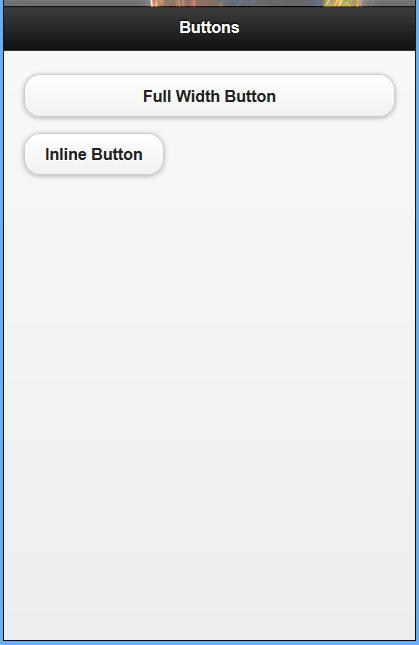
أضفنا الخاصية data-inline="true" إلى العنصر، وذلك يجعل الزر يستخدم مساحة تعادل المحتوى الذي بداخله فقط.
المثال 36: وضع الزر في سطر
<!DOCTYPE html>
<html>
<head>
  <title>Script-tutorials: Buttons jQuery Mobile</title>
  <meta name="viewport" content="width=device-width, initial-scale=1">
  <link rel="stylesheet" href="http://code.jquery.com/mobile/1.1.0/jquery.mobile-1.1.0.min.css" />
  <script src="http://code.jquery.com/jquery-1.7.1.min.js"></script>
  <script src="http://code.jquery.com/mobile/1.1.0/jquery.mobile-1.1.0.min.js"></script>
</head>
<body>
  <div data-role="page">
    <div data-role="header">
      <h1>Buttons</h1>
    </div>
    <div data-role="content">
      <a href="#" data-role="button" data-inline="true">An Inline Button</a>
      <a href="#" data-role="button" data-inline="true">Also an Inline Button</a>
    </div>
  </div>
</body>
</html>
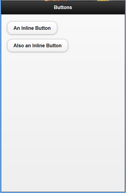
كلا الزرّين يملكان الخاصية data-inline="true" وهذا يعني أن كلا الزرّين سيظهران بجانب بعضهما البعض، وإضافة المزيد من الأزرار مع استخدام نفس الخاصية سيستمر بوضعهم بجانب بعضهم البعض إلى أن يصل إلى الحد الأقصى لعرض الصفحة.
ضبط عرض الزر وموقعه باستخدام الشبكة
مثال 37: ضبط عرض الزر وموقعه باستخدام الشبكة
<!DOCTYPE html>
<html>
<head>
  <title>Script-tutorials: Buttons jQuery Mobile</title>
  <meta name="viewport" content="width=device-width, initial-scale=1">
  <link rel="stylesheet" href="http://code.jquery.com/mobile/1.1.0/jquery.mobile-1.1.0.min.css" />
  <script src="http://code.jquery.com/jquery-1.7.1.min.js"></script>
  <script src="http://code.jquery.com/mobile/1.1.0/jquery.mobile-1.1.0.min.js"></script>
</head>
<body>
  <div data-role="page">
    <div data-role="header">
      <h1>Buttons</h1>
    </div>
    <div data-role="content">
      <div class="ui-grid-a">
        <div class="ui-block-a"><a href="#" data-role="button">Left</a>
        </div>
        <div class="ui-block-b"><a href="#" data-role="button">Right</a>
        </div>
      </div>
    </div>
  </div>
</body>
</html>
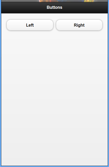
في هذا المثال، يمكننا رؤية شبكة بسيطة مكونة من عمودين. الصنف ui-block-a ينظم المحتوى في العمود الأول من الشبكة في حين يرصف الصنف ui-block-b المحتوى في العمود الثاني.
ترجمة -وبتصرّف- للمقال jQuery Mobile Lesson 4 لصاحبه Andrew
اقرأ أيضًا
- الدرس التالي: الأيقونات والأزرار وإنشاء تنسيقات مخصصة
- الدرس السابق: اتجاه الصفحة وأحداثها


أفضل التعليقات
لا توجد أية تعليقات بعد
انضم إلى النقاش
يمكنك أن تنشر الآن وتسجل لاحقًا. إذا كان لديك حساب، فسجل الدخول الآن لتنشر باسم حسابك.