

يتحدث هذا الدرس الجديد عن اتجاه صفحة الهاتف، وأحداث الصفحة (مثل pagebeforecreate، و pagecreate، و pageinit ...إلخ)، واللمس وأحداث التمرير (مثل swipe) وأحداث الفأرة الافتراضية. ستجد العديد من الأمثلة تشرح لك هذه الأحداث.
هذا الدرس جزء من سلسلة دروس تشرح jQuery Mobile:
- الدرس الأول: البداية، بناء وتقديم محتوى
- الدرس الثاني: التضمين، تهيئة الصفحة، التنقل بين الصفحات وأحداث التحميل
- الدرس الثالث: اتجاه الصفحة وأحداثها
- الدرس الرابع: ربط صفحات خارجية وتنظيم المحتوى بنظام الشبكة وبناء محتوى قابل للطي
- الدرس الخامس: الأيقونات والأزرار وإنشاء تنسيقات مخصصة
- الدرس السادس: إنشاء القوائم وتنسيقها وإنشاء نماذج البحث وتسجيل الدخول
التكيف مع حدث الاتجاه
هنالك خيارين/وضعين لاتجاه الشاشة عند عرض جهاز الهاتف، فعند عرض الصفحة عموديًا (portrait)، هذا يعني أن ارتفاع الشاشة أكبر من عرضها، وعند عرض الصفحة أفُقيًّا (landscape)، سيكون عرض الصفحة أكبر من طولها.
ما لم يُقفل الجهاز على وضع عرض واحد، يمكن أن تستدير الشاشة وسيتحول المحتوى تلقائيا للاستفادة من المساحة الإضافية، بينما يعالج jQuery Mobile تغيير حجم العديد من العناصر، قد تحتاج إلى تشغيل دالة معينة كلما تغيّر وضع الشاشة.
المثال 7: استخدام الحدث orientationchange، حدث تغيير الاتجاه
<!DOCTYPE html>
<html>
<head>
  <meta name="viewport" content="width=device-width, initial-scale=1">
  <link rel="stylesheet" href="http://code.jquery.com/mobile/1.4.5/jquery.mobile-1.4.5.min.css">
  <script src="http://code.jquery.com/jquery-1.11.3.min.js"></script>
  <script src="http://code.jquery.com/mobile/1.4.5/jquery.mobile-1.4.5.min.js"></script>
  <script>
  $(document).on("pagecreate",function(event){
    $(window).on("orientationchange",function(){
      if(window.orientation == 0) {
        $("p").text("The orientation has changed to portrait!").css({"background-color":"yellow","font-size":"300%"});
      } else {
        $("p").text("The orientation has changed to landscape!").css({"background-color":"pink","font-size":"200%"});
      }
    });
  });
  </script>
</head>
<body>
  <div data-role="page">
    <div data-role="header">
      <h1>The orientationchange Event</h1>
    </div>
    <div data-role="main" class="ui-content">
      <p>Try to rotate your device!</p>
      <p><b>Note:</b> You must use a mobile device, or a mobile emulator to see the effect of this event.</p>
    </div>
    <div data-role="footer">
      <h1>Footer Text</h1>
    </div>
  </div>
</body>
</html>
<!DOCTYPE html>
<html>
<head>
  <title>Script-tutorials: Page orientaton Event</title>
  <meta name="viewport" content="width=device-width, initial-scale=1">
  <link rel="stylesheet" href="http://code.jquery.com/mobile/1.4.5/jquery.mobile-1.4.5.min.css">
  <script src="http://code.jquery.com/jquery-1.11.3.min.js"></script>
  <script>
  $(document).on('pageinit', function() {
    $(window).on('orientationchange', function(e) {
      $("#mode").html('orientation is currently '+e.orientation);
    });
  });
  </script>
  <script src="http://code.jquery.com/mobile/1.4.5/jquery.mobile-1.4.5.min.js"></script>
</head>
<body>
  <div data-role="page" id="mode">
    <div data-role="header"><h1>Page orientaton Event</h1></div>
    <div data-role="main" class="ui-content">
      <p>Content in orientation</p>
      <a href="pageexist.html" data-role="button">External Page Exist</a>
      <a href="page_notexist.html" data-role="button">No Page Exist</a>
      <p>Try to rotate your device!</p>
      <p><b>Note:</b> You must use a mobile device, or a mobile emulator to see the effect of this event.</p>
    </div>
    <div data-role="footer">
      <h1>Script-tutorials.com</h1>
    </div>
  </div>
</body>
</html>
تهيئة الصفحة في jQuery mobile
المثال 8: تهيئة الصفحة في jQuery mobile
شيفرة الصفحة قبل تهيئة jQuery Mobile:
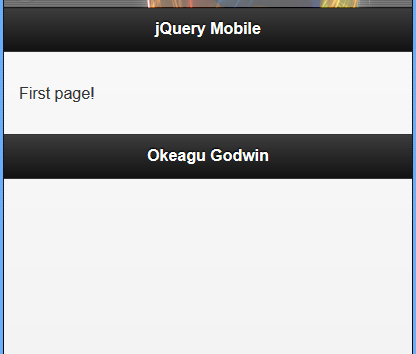
<!-- begin first page -->
<section id="page1" data-role="page">
  <header data-role="header"><h1>jQuery Mobile</h1></header>
  <div data-role="content">
    <p>First page!</p>
  </div>
  <footer data-role="footer"><h1>Footer</h1></footer>
</section>
<!-- end first page →
شيفرة الصفحة بعد تهيئة jQuery Mobile:
<!-- begin first page -->
<section class="ui-page ui-body-c ui-page-active" data-url="page1" id="page1" data-role="page">
  <header role="banner" class="ui-bar-a ui-header" data-role="header">
    <h1 aria-level="1" role="heading" tabindex="0" class="ui-title">jQuery Mobile</h1>
  </header>
  <div role="main" data-role="content" class="ui-content">
    <p>First page!</p>
  </div>
  <footer role="contentinfo" class="ui-bar-a ui-footer" data-role="footer">
    <h1 aria-level="1" role="heading" tabindex="0" class="ui-title">Footer</h1>
  </footer>
</section>
<!-- end first page →
تعطي كلا الشيفرتين نفس النتيجة:
عند إنشاء تطبيق jQuery، من الشائع ربط معالجات الحدث (event handlers) في حدث تحميل الصفحة (document load)، ويمكنك فعل شيء مشابه باستخدام أحداث عرض الصفحة وإخفاء الصفحة في jQuery Mobile، لكن كن حذرًا، بما أن أحداث عرض وإخفاء الصفحة تعمل في كل مرة يحدث فيها انتقالًا للصفحة. فقد تربط معالجات الحدث أكثر من مرة، فعلى سبيل المثال، إذا ربطت مستمع حدث الضغط إلى عنصر داخل حدث عرض الصفحة (page show event)، فإن مستمع حدث الضغطة يرتبط في كل مرة تظهر فيها الصفحة، وهذا جيد إذا كنت تستخدم تلك الصفحة فقط، لكن إذا ذهب المستخدم لتلك الصفحة عدة مرات، فإن مستمع الحدث سيرتبط عدة مرات.
لحل هذه المشكلة، يمكنك إما التحقق لمعرفة إذا كان معالج الحدث قد رُبط بالفعل (لكن لا تربطه مرة أخرى)، أو مسح الارتباط في كل مرة قبل إعادة الربط. وإذا استخدمت الطريقة الأخيرة، فاستعمال مجالات الأسماء (namespacing) سيكون مُفيدًا. للمزيد من المعلومات حول الأحداث ذات الأسماء المصنفة ضمن مجالات أسماء، راجع هذا التوثيق.
الأحداث المحدِّدة ضمن مجالات أسماء هي أداة مفيدة جدًا يمكن وضعها في صندوق أدوات jQuery.
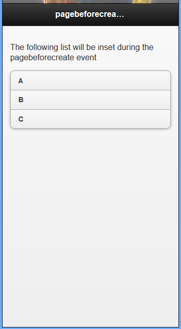
استخدام الحدث pagebeforecreate لإضافة خاصية بشكل ديناميكي
يُستخدم الحدث pagebeforecreate عندما تملك محتوى تريد تغييره قبل أن يمتلك jQuery Mobile فرصة لقفله وكتابة data-roles وخاصيات عناصر الصفحة إلى DOM.
المثال 9: استخدام الحدث pagebeforecreate لإضافة خاصية بشكل ديناميكي
يبدأ الملف كملف HTML قياسي يستخدم jQuery Mobile، لكننا بدأنا بالعنصر script، تُستخدم بعض الشيفرات البرمجية لـ jQuery لربط الحدث pagebeforecreate إلى الصفحة، ويتم هذا باستخدام الدالة .on() المتوفرة عند استخدام الإصدار jQuery 1.7 ومابعده. عندما يبحث الحدث pagebeforecreate على أية عناصر تملك الخاصية class="modify" وتطبق الخاصية datainset="true" إلى أي واحدة يُعثَر عليها باستخدام الدالة .attr().
يرى jQuery Mobile الخاصية data-inset="true" ويضعها في قائمة بسبب عمل الحدث pagebeforecreate قبل إضافة شيفرة الصفحة إلى DOM.
<!DOCTYPE html>
<html>
<head>
  <title>Script-tutorials: Developing with jQuery Mobile</title>
  <meta name="viewport" content="width=device-width, initial-scale=1">
  <link rel="stylesheet" href="http://code.jquery.com/mobile/1.1.0/jquery.mobile-1.1.0.min.css" />
  <script src="http://code.jquery.com/jquery-1.7.1.min.js"></script>
  <script>
  $(document).on('pagebeforecreate', function(event) {
    $(".modify").attr('data-inset','true');
  });
  </script>
  <script src="http://code.jquery.com/mobile/1.1.0/jquery.mobile-1.1.0.min.js"></script>
</head>
<body>
  <div data-role="page" id="home">
    <div data-role="header"><h1>pagebeforecreate event</h1></div>
    <div data-role="content">
      <p>The following list will be inset during the pagebeforecreate event</p>
      <ul class="modify" data-role="listview">
        <li>A</li>
        <li>B</li>
        <li>C</li>
      </ul>
    </div>
  </div>
</body>
</html>
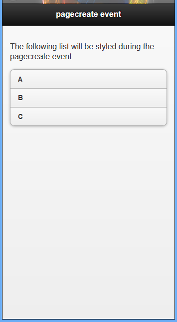
استخدام الحدث pagecreate
يمكن استخدام الحدث pagecreate إما لتطبيق الودجات (widgets) الخاصة بك أو استخدام ودجة (widget) مدمجة أو إضافة تحكم يوفرها jQuery Mobile.
المثال 8: استخدام الحدث pagecreate بالاقتران مع الإضافة listview
تبدأ الشيفرة البرمجية كصفحة قياسية باستخدام jQuery Mobile، وتستخدم الدالة .on() الحدث pagecreate للعمل.
هنالك مُحدد (selector) لإيجاد أي عنصر في الصفحة التي تملك الخاصية class="modify" ومن ثم يُضيف الخاصية data-inset="true". وبعد فعل ذلك، يمكنك أن ترى عمل الدالة listview(). تُعرف هذه الدالة على أنها الإضافة listview وتُستخدم لتطبيق نمط وشكل أي قائمة. السطر 11 هو نهاية الدالة .on()، والتي هي ربط للحدث pagecreate.
هنالك عنصر ul يحتوي فقط على الخاصية class="modify"؛ الخاصية data-role="listview" لن تكون موجودة ولا الخاصية data-inset="true".
<!DOCTYPE html>
<html>
<head>
  <title>Script-tutorials: Developing with jQuery Mobile</title>
  <meta name="viewport" content="width=device-width, initial-scale=1">
  <link rel="stylesheet" href="http://code.jquery.com/mobile/1.1.0/jquery.mobile-1.1.0.min.css" />
  <script src="http://code.jquery.com/jquery-1.7.1.min.js"></script>
  <script>
  $(document).on('pagecreate', function(event) {
    $(".modify").attr('data-inset','true').listview();
  });
  </script>
  <script src="http://code.jquery.com/mobile/1.1.0/jquery.mobile-1.1.0.min.js"></script>
</head>
<body>
  <div data-role="page" id="home">
    <div data-role="header"><h1>pagecreate event</h1></div>
    <div data-role="content">
      <p>The following list will be styled during the pagecreate event</p>
      <ul class="modify">
        <li>A</li>
        <li>B</li>
        <li>C</li>
      </ul>
    </div>
  </div>
</body>
</html>
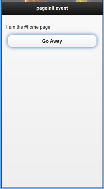
استخدام الحدث pageinit
أفضل وصف للحدث pageinit هو: «استخدمه كما لو تستخدم الدالة $(document).ready() في jQuery. يعمل هذا الحدث بعد تحميل DOM وعمل جميع الودجات والإضافات، ويعمل أيضًا كلما تُحمّلت الصفحة إما مباشرةً أو من خلال استدعاء AJAX من الصفحة الأخرى، وسيعمل هذا الحدث مرة واحدة عند تضمينه في DOM.
استخدام pageinit عند تحميل صفحة ثانية
يجب أن يكون الإعداد الأولي للصفحة مألوفًا بالنسبة لك الآن؛ في البداية، يمكنك أن ترى أنه يستخدم نفس الأسلوب لربط الحدث pageinit كما رُبِط الحدثpagebeforecreate والحدث pagecreate. الفرق هو في استخدام مُحدد (selector) لعنصر ذي المُعرِّف id="away" في الدالة .on() لربط الدالة alert() التي ستعمل فقط على الصفحة التي تطابق ذلك المحدد عند تحميلها لأول مرة في DOM.
بالنزول إلى الأسفل أكثر، سترى أن الصفحة أُعدّت مع عنصر div باستخدام الخاصية data-role="page".
المثال 9: استخدام pageinit عند تحميل الصفحة الثانية
<!DOCTYPE html>
<html>
<head>
  <title>Script-tutorials: Developing with jQuery Mobile</title>
  <meta name="viewport" content="width=device-width, initial-scale=1">
  <link rel="stylesheet" href="http://code.jquery.com/mobile/1.1.0/jquery.mobile-1.1.0.min.css" />
  <script src="http://code.jquery.com/jquery-1.7.1.min.js"></script>
  <script>
  $(document).on('pageinit','#away', function(event) {
    alert("The pageinit event has been run");
  });
  </script>
  <script src="http://code.jquery.com/mobile/1.1.0/jquery.mobile-1.1.0.min.js"></script>
</head>
<body>
  <div data-role="page" id="home">
    <div data-role="header"><h1>pageinit event</h1></div>
    <div data-role="content">
      <p>I am the #home page</p>
      <a href="#away" data-role="button">Go Away</a>
    </div>
  </div>
  <div data-role="page" id="away">
    <div data-role="header"><h1>pageinit event</h1></div>
    <div data-role="content">
      <p>
      I am the #away page. The pageinit event runs on first page load.
      </p>
      <a href="#home" data-role="button">Go Back</a>
    </div>
  </div>
</body>
</html>
الصورة الأولى للمعاينة في المتصفح.
الصور الثانية تظهر عند الضغط على الزر Go Away في المتصفح.
الصورة الثالث هي للصورة المُهيَّأة.
الآن لننظر في نمط تهيئة الصفحة في jQuery Mobile.
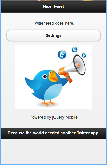
المثال 10: تغريدة جميلة دون سكربت التهيئة
<!DOCTYPE html>
<html>
<head>
  <title>Script-Tutorials: My first mobile site</title>
  <meta name="viewport" content="width=device-width, initial-scale=1">
  <link rel="stylesheet" href="http://code.jquery.com/mobile/1.1.0/jquery.mobile-1.1.0.min.css"/>
  <script src="http://code.jquery.com/jquery-1.7.1.min.js"></script>
  <script src="http://code.jquery.com/mobile/1.1.0/jquery.mobile-1.1.0.min.js"></script>
  <style>
    img {max-width:100%;} p{text-align:center;}
  </style>
</head>
<body>
  <!-- begin first page -->
  <section id="page1" data-role="page">
    <header data-role="header">
      <h1>Nice Tweet</h1>
    </header>
    <div data-role="content" class="content">
      <p>Twitter feed goes here.</p>
      <p><a href="#page2" data-role="button">Settings</a></p>
      <p><img src="images/twitter-logo-hashtag.jpg" alt="Twitter settings" /></p>
      <p>Powered by jQuery Mobile</p>
    </div>
    <footer data-role="footer">
    <h2>Because the world needed another Twitter app.</h2>
    </footer>
  </section>
  <!-- end first page -->
  <!-- Begin second page -->
  <section id="page2" data-role="page">
    <header data-role="header">
      <h1> Nice Tweet: Settings</h1>
    </header>
    <div data-role="content" class="content">
      <p>Settings go here. <a href="#page1" data-role="button">Go back</a></p>
      <p><img src="images/business-twitter-page-img.png" alt="Settings" /></p>
      <p style="text-align:center;">Powered by jQuery Mobile</p>
    </div>
    <footer data-role="footer">
      <h2>Because the world needed another Twitter app.</h2>
    </footer>
  </section>
  <!-- end second page -->
</body>
</html>
<script>
$(document).ready(function() {
  // Refresh the feed on first load
  // (pretend we've written this function elsewhere)
  refreshFeed();
  $("#page1").bind("pageshow", function(event, ui) {
    // Refresh the feed on subsequent page shows
    refreshFeed();
  })
})
</script>

أحداث اللمس
عند تفاعل المستخدم مع موقعك عن طريق اللمس، ستعمل أحداث اللمس، ويمكنك الاستفادة من هذه الأحداث لعمل دوال مخصصة.
استخدام أحداث tap الفرق الرئيسي بين حدث النقر click وحدث بدء اللمس touchstart هو حوالي 300 ملي ثانية. في حين أن هذا لا يبدو فارقًا كبيرًا في الوقت، لكن تأخير ثلث ثانية قد يجعل موقعك أو تطبيقك يبدو بطيئًا وغير متجاوب.
بينما يُستخدم الحدث tap بشكل افتراضي على الروابط، والقوائم، وودجات وإضافات jQuery Mobile المتشابهة، يمكنك استخدام الحدث tap لتنفيذ دوال مخصصة في مختلف عناصر صفحتك.
مثال 11: استخدام الحدثين tap و taphold
<!DOCTYPE html>
<html>
<head>
  <title>Developing with jQuery Mobile</title>
  <meta name="viewport" content="width=device-width, initial-scale=1">
  <link rel="stylesheet" href="http://code.jquery.com/mobile/1.1.0/jquery.mobile-1.1.0.min.css" />
  <script src="http://code.jquery.com/jquery-1.7.1.min.js"></script>
  <script>
  $(document).on("pageinit", function(){
    $("#home").on('tap', '#image', function(event, ui) {
      var tapCaption = $(this).data("tap");
      $("#caption").addClass("comment").html(tapCaption);
    });
    $("#home").on('taphold','#caption', function(event, ui) {
      var $this = $(this);
      var tapholdCaption = $this.data("appTaphold");
      $this.html(tapholdCaption);
    });
  });
  </script>
  <script src="http://code.jquery.com/mobile/1.1.0/jquery.mobile-1.1.0.min.js"></script>
  <style type="text/css">
  img {max-width: 100%}
  .comment {background: #FFF;border-radius: 5px;
  border: 2px solid #000;padding: 5px}
  </style>
</head>
<body>
  <div data-role="page" id="home">
    <div data-role="header"><h1>Tap Events</h1></div>
    <div data-role="content">
      <p>Tap or tap-and-hold the image below.</p>
      <img id="image" src="images/golden_gate.jpg" alt="An image of a river" data-tap="You tapped the picture, try tap-and-holding on this caption" />
      <div id="caption" data-app-taphold="This picture was taken during a flood.">Caption</div>
    </div>
  </div>
</body>
</html>
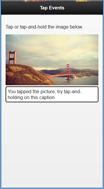
يجب ربط الحدثين tap و taphold إما في الدالة document.ready() أو داخل الحدث pageinit. بما أننا نعلم بالفعل أنه من غير المستحسن استخدام الدالة document.ready() مع jQuery Mobile، لذلك سنربط الحدث pageinit باستخدام الدالة .on(). داخل الدالة، يمكنك رؤية الدالة .on() تربط الحدث tap إلى عنصر يملك الخاصية id="image".
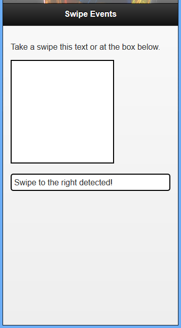
استخدام أحداث التمرير
من الشائع التمرير في الهاتف عند التنقل في معرض صور، وحذف بريد إلكتروني، وإحضار معلومات الاتصال …إلخ. يمكنك مع jQuery Mobile استخدام ثلاثة أحداث متعلقة بالتمرير هي: swipe، و swipeleft، و swiperight. تشبه عملية التمرير (swipe) في الهاتف المحمول عملية النقر والسحب (click-and-drag ) في الحاسوب. ليعمل أي حدث من أحداث التمرير، يجب أن يتحرك اللمس على أكثر من 30 بيكسل أفقيًا ويبقى 1 ثانية ليكتمل، كما أنه لا يجب أن يتحرك أكثر من 20 بيكسل عموديًا وإلا سيُلغى تشغيل الحدث.
مثال 12: استخدام أحداث التمرير
ستُعرض الصورة في الأسفل عند تمرير المربع إلى اليمين كما يظهر على متصفح هاتفك في جهازك المحمول.
<!DOCTYPE html>
<html>
<head>
  <title>Developing with jQuery Mobile</title>
  <meta name="viewport" content="width=device-width, initial-scale=1">
  <link rel="stylesheet" href="http://code.jquery.com/mobile/1.1.0/jquery.mobile-1.1.0.min.css" />
  <script src="http://code.jquery.com/jquery-1.7.1.min.js"></script>
  <script>
  $(document).on('pageinit', function() {
    $("#home").on('swipe','#swipe', function(event, ui) {
      $("#caption").html("Swipe detected!");
    });
    $("#home").on('swipeleft','#swipe-box', function(event, ui) {
      ("#caption").html("Swipe to the left detected!");
    });
    $("#home").on('swiperight','#swipe-box', function(event, ui) {
      $("#caption").html("Swipe to the right detected!");
    });
  });
  </script>
  <script src="http://code.jquery.com/mobile/1.1.0/jquery.mobile-1.1.0.min.js"></script>
  <style type="text/css">
  #swipe-box {
    width: 200px;
    height: 200px;
    background: #FFF;
    border: 2px solid #000
  }
  .comment {
    background: #FFF;
    border-radius: 5px;
    border: 2px solid #000;
    padding: 5px
  }
  </style>
</head>
<body>
  <div data-role="page" id="home">
    <div data-role="header"><h1>Swipe Events</h1></div>
    <div data-role="content">
      <p id="swipe">Take a swipe this text or at the box below.</p>
      <div id="swipe-box"></div>
      <br />
      <div id="caption" class="comment">Waiting for swipe...</div>
    </div>
  </div>
</body>
</html>
أحداث الفأرة الافتراضية
أحداث الفأرة الافتراضية هي حل لمشاكل التوافق بين متصفحات الهاتف والحاسوب، فعلى سبيل المثال، تدعم بعض المتصفحات حدثًا يسمى touchstart في حين بعض المتصفحات الأخرى لا تدعمه.
تدعم متصفحات الحاسوب الحدث mousemove وتدعم الحومان (hover) عبر استخدام الحدث mouseover في حين تواجه أجهزة الهاتف صعوبةً في محاكاة أو استخدام الحدث الصحيح. هذه المشاكل حلتها jQuery Mobile عن طريق استخدام أحداث الفأرة الافتراضية، فعند تحميل صفحة مع jQuery Mobile، سيتأكد المتصفح من دعم الحدث.
وستُدعم الأحداث آنذاك بناءً على أحداث الفأرة الافتراضية، بينما يحدث هذا في الخلفية، يمكنك ربط أحداث الفأرة الافتراضية لتشغيل دوال محدد أو حتى الحصول على بيانات يمكن استخدامها في دوال أخرى.
أحداث الفأرة الافتراضية المتاحة هي:
-
vmouseover -
vmousedown -
vmousemove -
vmouseup -
vclick -
vmousecancel
ستجد في الأسفل جزءًا من شيفرة برمجية موجودة في الوسم <head> لاستخدام الأحداث vmousedown و vmousemove و vmouseover.
المثال 13: مقتطف شيفرة برمجية لأحداث vmousedown، و vmousemove و vmouseover
<script>
$(function(){
  $(document).on("vmousedown", "p", function() {
    $(this).append('<span style="color:#108040;">vmousedown...</span>');
  });
});
</script>
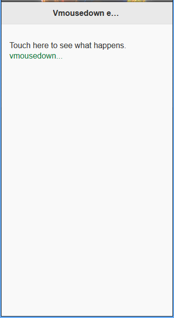
المثال 14: الحدث vmousedown في jQuery mobile
بمجرد النقر على التسمية التوضيحية داخل المتصفح، سيُطلَق الحدث vmousedown.
<!doctype html>
<html lang="en">
<head>
  <meta charset="utf-8">
  <meta name="viewport" content="width=device-width, initial-scale=1">
  <title>Script-tutorials: vmousedown</title>
  <link rel="stylesheet" href="//code.jquery.com/mobile/1.4.5/jquery.mobile-1.4.5.min.css" />
  <script src="//code.jquery.com/jquery-1.10.2.min.js"></script>
  <script>
  $( function(){
    $(document).on("vmousedown", "p", function() {
      $(this).append('<span style="color:#108040;"> vmousedown...</span>');
    });
  });
  </script>
  <script src="//code.jquery.com/mobile/1.4.5/jquery.mobile-1.4.5.min.js"></script>
</head>
<body>
  <div data-role="page">
    <div data-role="header"><h1>Vmousedown event example</h1></div>
    <div data-role="content">
      <p>Touch here to see what happens.</p>
    </div>
  </div>
</body>
</html>
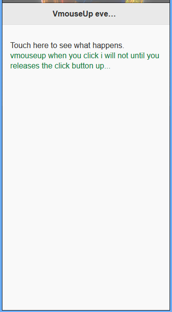
المثال 15: الحدث vmouseup في jQuery mobile
<!doctype html>
<html lang="en">
<head>
  <meta charset="utf-8">
  <meta name="viewport" content="width=device-width, initial-scale=1">
  <title>Script-tutorials: vmouseup</title>
  <link rel="stylesheet" href="//code.jquery.com/mobile/1.4.5/jquery.mobile-1.4.5.min.css" />
  <script src="//code.jquery.com/jquery-1.10.2.min.js"></script>
  <script>
    $(function() {
      $(document).on("vmouseup", "p", function() {
        $(this).append('<span style="color:#108040;"> vmouseup when you click i will not until you releases the click button up...</span>');
      });
    });
  </script>
  <script src="//code.jquery.com/mobile/1.4.5/jquery.mobile-1.4.5.min.js"></script>
</head>
<body>
  <div data-role="page">
    <div data-role="header">
      <h1>VmouseUp event example</h1>
    </div>
    <div data-role="content">
      <p>Touch here to see what happens.</p>
    </div>
  </div>
</body>
</html>
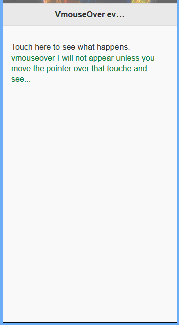
المثال 16: الحدث vmouseup في jQuery mobile
<!doctype html>
<html lang="en">
<head>
  <meta charset="utf-8">
  <meta name="viewport" content="width=device-width, initial-scale=1">
  <title>Script-tutorials: vmouseover</title>
  <link rel="stylesheet" href="//code.jquery.com/mobile/1.4.5/jquery.mobile-1.4.5.min.css" />
  <script src="//code.jquery.com/jquery-1.10.2.min.js"></script>
  <script>
    $(function() {
      $(document).on("vmouseover", "p", function() {
        $(this).append('<span style="color:#108040;"> vmouseover I will not appear unless you move the pointer over that touche and see...</span>');
      });
    });
  </script>
  <script src="//code.jquery.com/mobile/1.4.5/jquery.mobile-1.4.5.min.js"></script>
</head>
<body>
  <div data-role="page">
    <div data-role="header">
      <h1>VmouseOver event example</h1>
    </div>
    <div data-role="content">
      <p>Touch here to see what happens.</p>
    </div>
  </div>
</body>
</html>
بناء موقعك الأول المخصص للهواتف باستخدام jQuery mobile
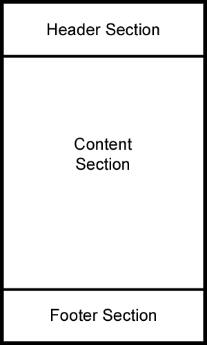
الترويسة (Header)
هذا القسم هو أول شيء يراه المستخدم، وقد يكون أبرز خاصية لموقع الهاتف، ويُعلم هذا المستخدمين بمكانهم، وقد يتضمن شريط بحث، وزر دعوة إلى إجراء (call-to-action)، و/أو شعار.
قسم المحتوى (Content)
يحتوي هذا القسم على ما يبدو عليه: أزرار، ونصوص وكل شيء آخر لم يتضمن في الأقسام الأخرى. يضم هذا القسم جوهر موقعك ويعرض كل ما تريد أن يراه المستخدم أو يقضي فيه وقته.
تذييل الصفحة (Footer)
غالبا ما يُتجاهل هذا القسم لكنه منطقة مهمة من موقعك، فيمكن أن يحتوي على كل شيء بدءًا من الروابط الإضافية إلى سطر بسيط لملكية الموقع.
عند تطوير مواقع الويب للهواتف، يُحذَف في العادة هذا القسم ويُستبدل بشريط تنقل أو عنصر ثابت آخر.
مثال 16: تخطيط أساسي للهواتف
<!DOCTYPE html>
<html>
<head>
  <title>Script-tutorials: My first mobile site</title>
  <meta name="viewport" content="width=device-width, initial-scale=1">
  <link rel="stylesheet" href="http://code.jquery.com/mobile/1.1.0/jquery.mobile-1.1.0.min.css" />
  <script src="http://code.jquery.com/jquery-1.7.1.min.js"></script>
  <script src="http://code.jquery.com/mobile/1.1.0/jquery.mobile-1.1.0.min.js"></script>
</head>
<body>
  <div data-role="page">
    <div data-role="content">
      Welcome message.
    </div>
  </div>
</body>
</html>
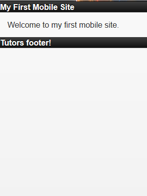
مثال 17: إضافة ترويسة وتذييل إلى موقعك المخصص للهواتف
<!DOCTYPE html>
<html>
<head>
  <title>Script-tutorials: My first mobile site</title>
  <meta name="viewport" content="width=device-width, initial-scale=1">
  <link rel="stylesheet" href="http://code.jquery.com/mobile/1.1.0/jquery.mobile-1.1.0.min.css" />
  <script src="http://code.jquery.com/jquery-1.7.1.min.js"></script>
  <script src="http://code.jquery.com/mobile/1.1.0/jquery.mobile-1.1.0.min.js"></script>
</head>
<body>
  <div data-role="page">
    <div data-role="header">
      My First Mobile Site
    </div>
    <div data-role="content">
      Welcome to my first mobile site.
    </div>
    <div data-role="footer">
      Tutors footer!
    </div>
  </div>
</body>
</html>
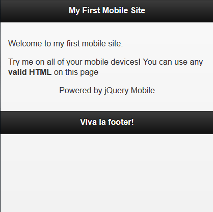
المثال 18: تنسيق المحتوى النصي في الموقع عبر تضمين وسوم التنسيق
<!DOCTYPE html>
<html>
<head>
  <title>Script-tutorials: My first mobile site</title>
  <meta name="viewport" content="width=device-width, initial-scale=1">
  <link rel="stylesheet" href="http://code.jquery.com/mobile/1.1.0/jquery.mobile-1.1.0.min.css" />
  <script src="http://code.jquery.com/jquery-1.7.1.min.js"></script>
  <script src="http://code.jquery.com/mobile/1.1.0/jquery.mobile-1.1.0.min.js"></script>
</head>
<body>
  <div data-role="page">
    <div data-role="header">
      <h1>My First Mobile Site</h1>
    </div>
    <div data-role="content">
      <p>Welcome to my first mobile site.</p>
      <p>Try me on all of your mobile devices! You can use any
        <strong>valid HTML</strong> on this page</p>
      <p style="text-align:center;">Powered by jQuery Mobile</p>
    </div>
    <div data-role="footer">
      <h3>Tutors footer!</h3>
    </div>
  </div>
</body>
</html>
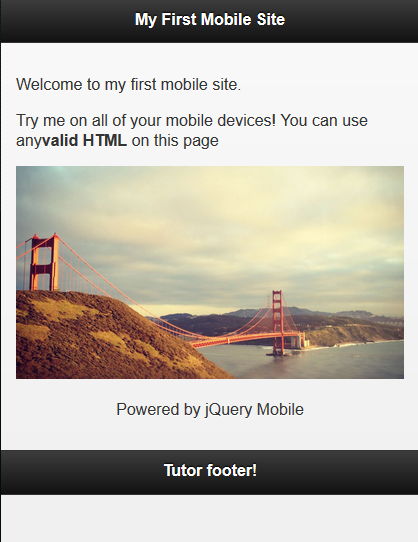
المثال 19: إضافة صور ذات حجم متغير (متجاوبة) إلى الموقع
<!DOCTYPE html>
<html>
<head>
  <title>My first mobile site</title>
  <meta name="viewport" content="width=device-width, initial-scale=1">
  <link rel="stylesheet" href="http://code.jquery.com/mobile/1.1.0/jquery.mobile-1.1.0.min.css" />
  <script src="http://code.jquery.com/jquery-1.7.1.min.js"></script>
  <script src="http://code.jquery.com/mobile/1.1.0/jquery.mobile-1.1.0.min.js"></script>
  <style>
    img {
      max-width: 100%;
    }
  </style>
</head>
<body>
  <div data-role="page">
    <div data-role="header">
      <h1>My First Mobile Site</h1>
    </div>
    <div data-role="content">
      <p>Welcome to my first mobile site.</p>
      <p>Try me on all of your mobile devices! You can use any<strong>valid HTML</strong> on this page</p>
      <img src="images/golden_gate.jpg" alt="Golden Gate Bridge" />
      <p style="text-align:center;">Powered by jQuery Mobile</p>
    </div>
    <div data-role="footer">
      <h3>Tutor footer!</h3>
    </div>
  </div>
</body>
</html>
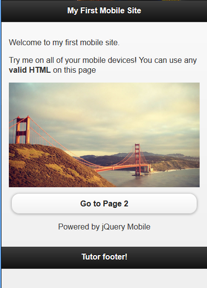
المثال 20:الربط مع صفحة ثانية عبر الحدث vmouseup
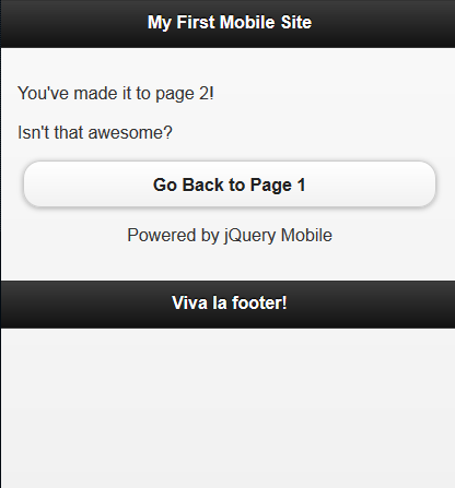
<!DOCTYPE html>
<html>
<head>
  <title>Script-Tutorials: My first mobile site</title>
  <meta name="viewport" content="width=device-width, initial-scale=1">
  <link rel="stylesheet" href="http://code.jquery.com/mobile/1.1.0/jquery.mobile-1.1.0.min.css" />
  <script src="http://code.jquery.com/jquery-1.7.1.min.js"></script>
  <script src="http://code.jquery.com/mobile/1.1.0/jquery.mobile-1.1.0.min.js"></script>
  <style>
    img {
      max-width: 100%;
    }
  </style>
</head>
<body>
  <div id="pageone" data-role="page">
    <div data-role="header">
      <h1>My First Mobile Site</h1>
    </div>
    <div data-role="content">
      <p>Welcome to my first mobile site.</p>
      <p>Try me on all of your mobile devices! You can use any
        <strong>valid HTML</strong> on this page</p>
      <img src="images/golden_gate.jpg" alt="Golden Gate Bridge" />
      <a href="#pagetwo" data-role="button">Go to Page 2</a>
      <p style="text-align:center;">Powered by jQuery Mobile</p>
    </div>
    <div data-role="footer">
      <h3>Tutor footer!</h3>
    </div>
  </div>
  <div id="pagetwo" data-role="page">
    <div data-role="header">
      <h1>My First Mobile Site</h1>
    </div>
    <div data-role="content">
      <p>You've made it to page 2!</p>
      <p>Isn't that awesome?</p>
      <a href="#pageone" data-role="button">Go Back to Page 1</a>
      <p style="text-align:center;">Powered by jQuery Mobile</p>
    </div>
    <div data-role="footer">
      <h3>Viva la footer!</h3>
    </div>
  </div>
</body>
</html>
مثال 21: ثلاثة صفحات داخلية في ملف HTML واحد
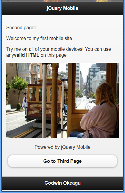
<!DOCTYPE html>
<html>
<head>
  <title>Script-Tutorials: My first mobile site</title>
  <meta name="viewport" content="width=device-width, initial-scale=1">
  <link rel="stylesheet" href="http://code.jquery.com/mobile/1.1.0/jquery.mobile-1.1.0.min.css" />
  <script src="http://code.jquery.com/jquery-1.7.1.min.js"></script>
  <script src="http://code.jquery.com/mobile/1.1.0/jquery.mobile-1.1.0.min.js"></script>
  <style>
    img {
      max-width: 100%;
    }
  </style>
</head>
<body>
  <!-- begin first page -->
  <section id="page1" data-role="page">
    <header data-role="header">
      <h1>jQuery Mobile</h1>
    </header>
    <div data-role="content" class="content">
      <p>First page!</p>
      <p>Welcome to my first mobile site.</p>
      <p>Try me on all of your mobile devices! You can use any<strong>valid HTML</strong> on this page</p>
      <img src="images/golden_gate.jpg" alt="Golden Gate Bridge" />
      <p style="text-align:center;">Powered by jQuery Mobile</p>
      <p><a href="#page2" data-role="button">Go to Second Page</a>
      </p>
    </div>
    <footer data-role="footer">
      <h1>Footer</h1>
    </footer>
  </section>
  <!-- end first page -->
  <!-- Begin second page -->
  <section id="page2" data-role="page">
    <header data-role="header">
      <h1>jQuery Mobile</h1>
    </header>
    <div data-role="content" class="content">
      <p>Second page!</p>
      <p>Welcome to my first mobile site.</p>
      <p>Try me on all of your mobile devices! You can use any<strong>valid HTML</strong> on this page</p>
      <img src="images/cable_car2.jpg" alt="Cable Car" />
      <p style="text-align:center;">Powered by jQuery Mobile</p>
      <p><a href="#page3" data-role="button">Go to Third Page</a>
      </p>
    </div>
    <footer data-role="footer">
      <h1>Footer</h1>
    </footer>
  </section>
  <!-- end second page -->
  <!-- begin third page -->
  <section id="page3" data-role="page">
    <header data-role="header">
      <h1>jQuery Mobile</h1>
    </header>
    <div data-role="content" class="content">
      <p>Third page!</p>
      <p>Welcome to my first mobile site.</p>
      <p>Try me on all of your mobile devices! You can use any<strong>valid HTML</strong> on this page</p>
      <img src="images/alcatraz.jpg" alt="alcatraz" />
      <p style="text-align:center;">Powered by jQuery Mobile</p>
      <p><a href="#page1" data-role="button">Go back to First Page</a>
      </p>
    </div>
    <footer data-role="footer">
      <h1>Footer</h1>
    </footer>
  </section>
  <!-- end third page -->
</body>
</html>


ترجمة -وبتصرّف- للمقال jQuery Mobile Lesson 3 لصاحبه Andrew


أفضل التعليقات
لا توجد أية تعليقات بعد
انضم إلى النقاش
يمكنك أن تنشر الآن وتسجل لاحقًا. إذا كان لديك حساب، فسجل الدخول الآن لتنشر باسم حسابك.